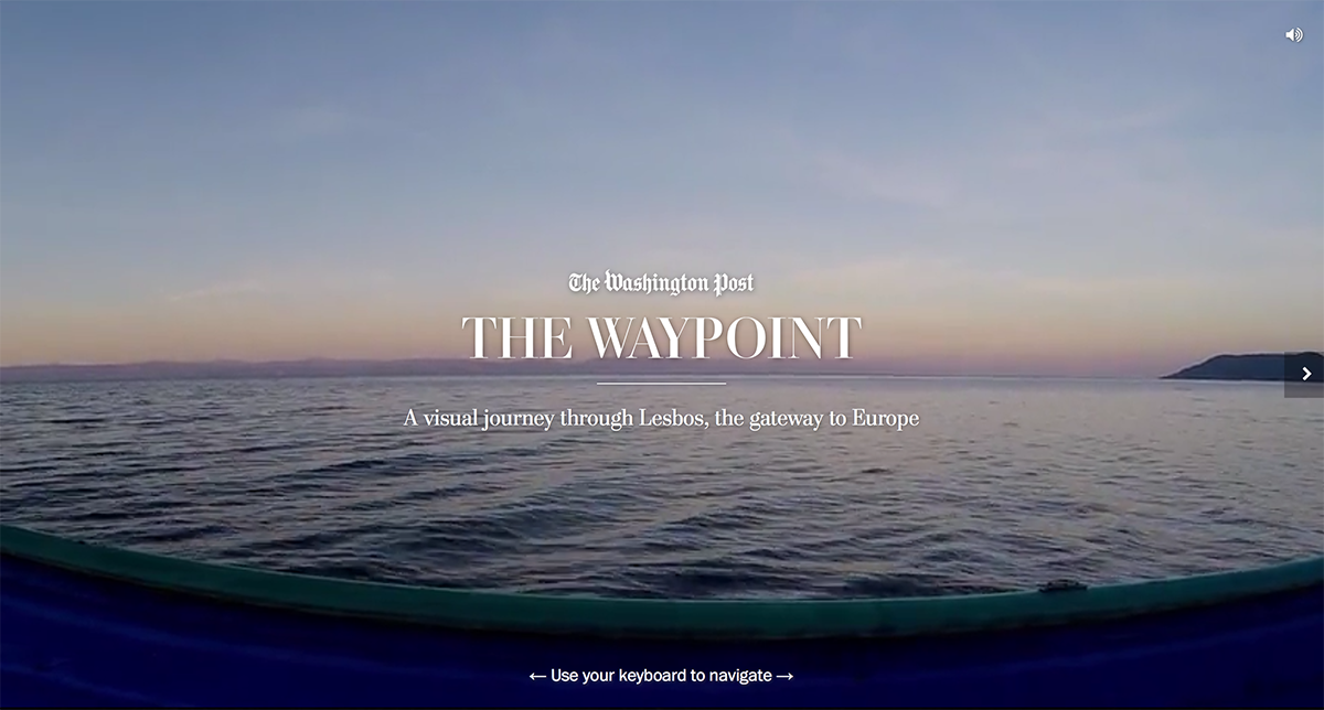
Sin Luz

Published in The Washington Post, December 2017


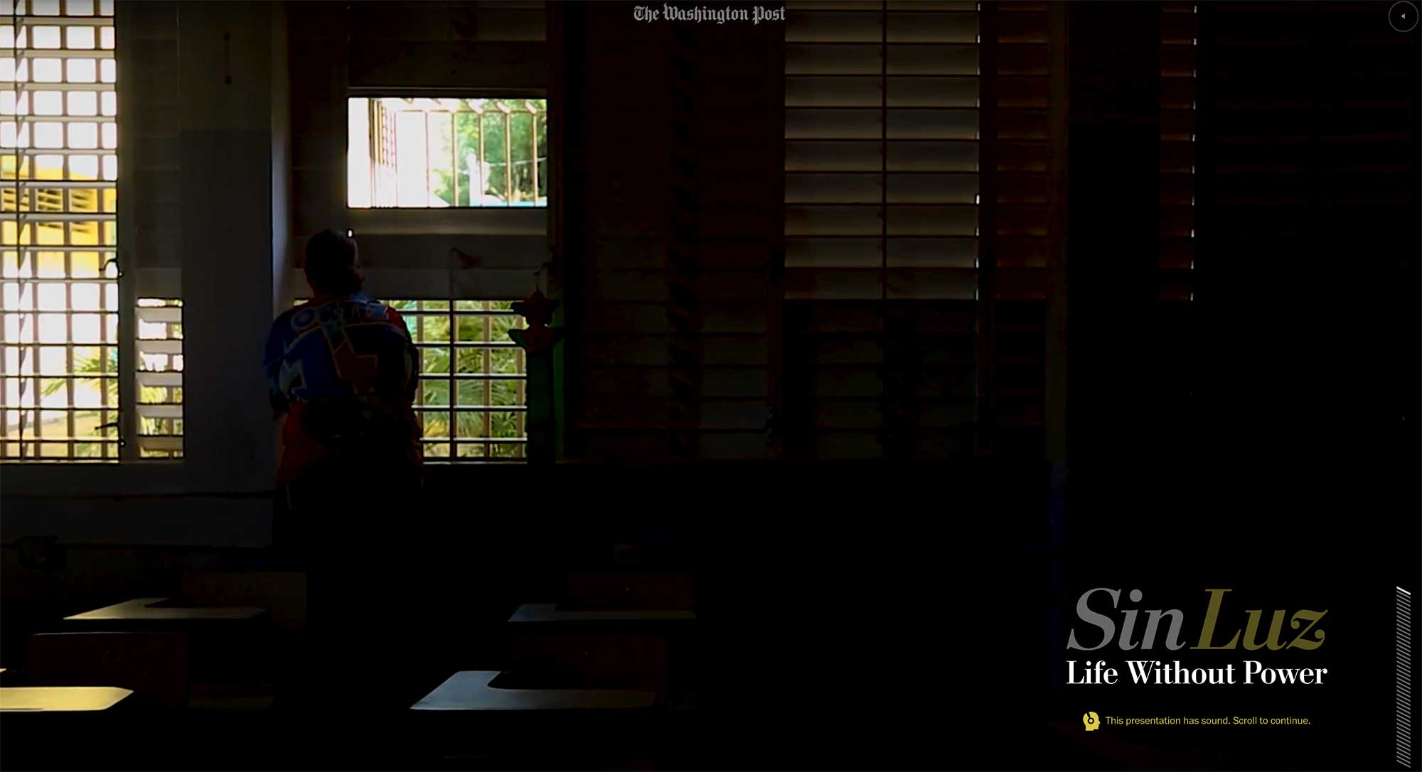
I was a lead editor and project manager on this story, which showed the difficulty of life without power after Hurricane Maria devastated Puerto Rico, and the resilience of the Puerto Rican people as they dealt with the challenges.

Sin Luz

In addition to smart user interface design and an incredibly powerful story, we created 3-D terrain maps of the island and used photogrammetry and drone footage to recreate the scene.

Role: Editing, project management

Awards: World Press Photo, Immersive Storytelling, second prize

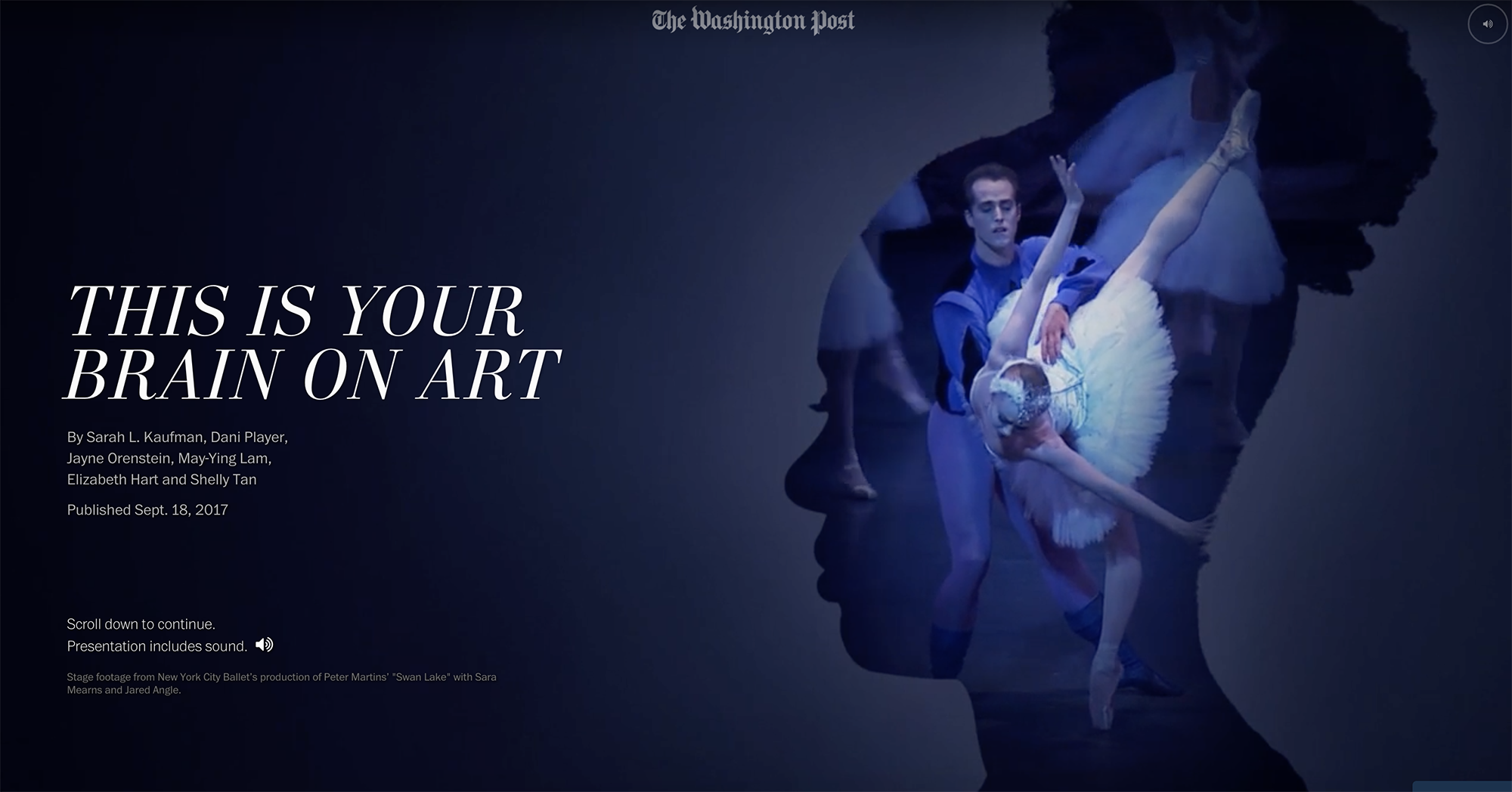
Visually communicating uncertainty: An experiment

I was just reading this article by Nate Silver in fivethirtyeight, which explores the different ways journalists miscommunicate probabilities.

This particular sentence caught my interest: “People associate numbers with precision, so using numbers to express uncertainty in the form of probabilities might not be intuitive.”

So, what if we tried to visually communicate that imprecision. Instead of 25.4 percent, which feels very solid, we represented it as 25.4 percent.

Live presentation for 2016 election

Published in The Washington Post, November 2016

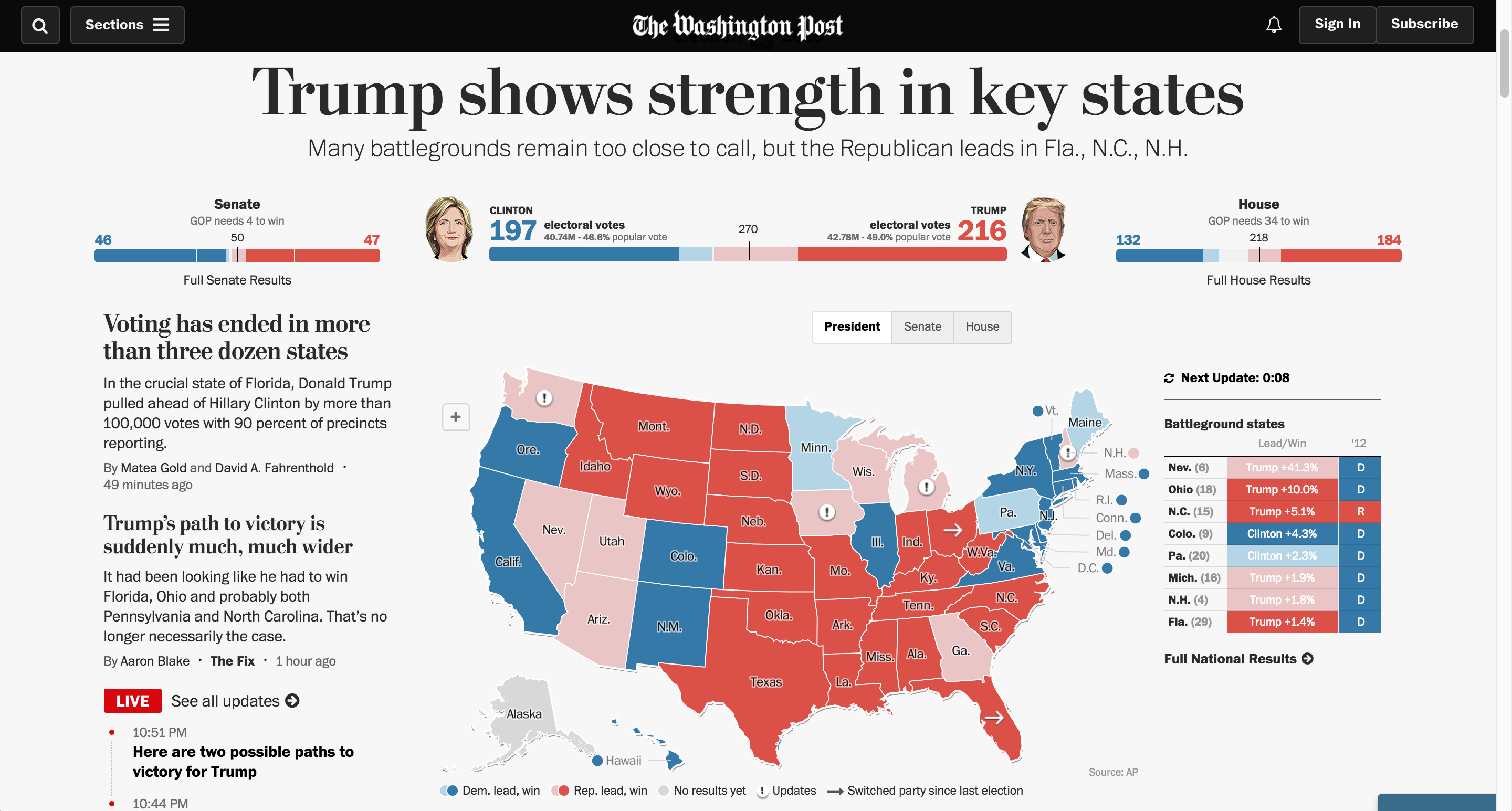
US Election results 2016

I pitched, developed and managed a partnership with Development Seed to execute the engineering and presentation of results displays for the 2016 election cycle. I was the project lead, working across multiple departments internally and externally to manage contracts, understand and prioritize needs, develop strategy, test and improve the technology and brief stakeholders.

These maps ran across The Washington Post products, including our site and native applications on iOS and Android, and many of our news service client sites.

Role: Editing, project management

My team also created dozens of other fantastic graphics for the election, collected here.

A New Age of Walls

Published in The Washington Post, October 2016

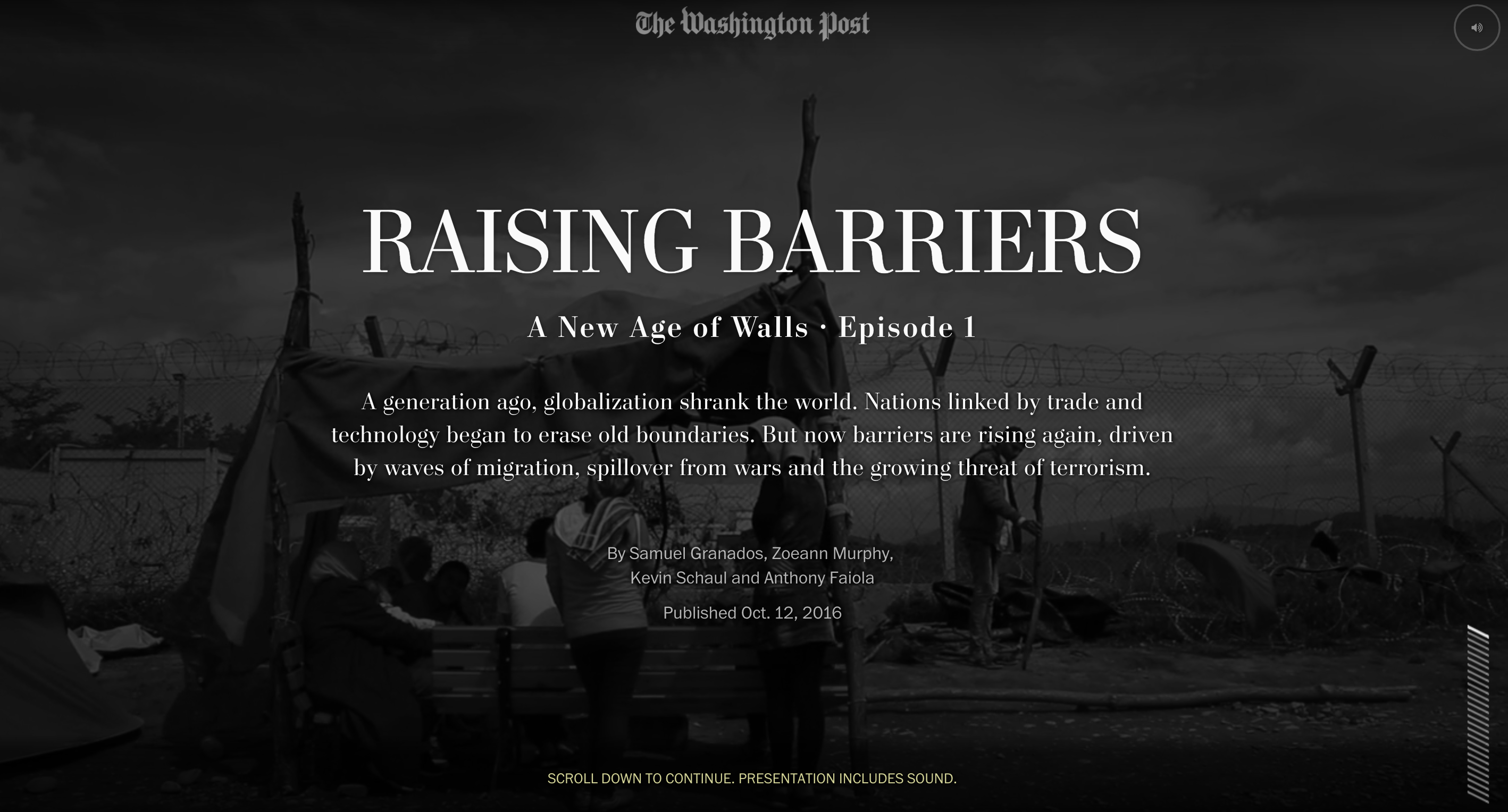
A New Age of Walls

I was the lead editor and project manager on this 3-part series, which explained the rise of barriers worldwide as a means of preventing migration and providing border security. It explored their effectiveness and impact in a deeply compelling narrative that melded text, video and graphics in ways we haven’t tried before. My team led the field reporting in collaboration with foreign correspondents, and I led the editing team, which also included a video editor and the foreign editor.

Role: Editing, project management, storyboarding, prototyping

Awards: Malofiej International Infographics Awards Human Rights Best Graphics Award and Gold medal in features category; Gold medal in the Society of News Design digital awards; Finalist for a Webby award; White House News Photographers Association, First place in Best Multimedia Package; First prize in Innovative Storytelling in World Press Photo’s 2017 Digital Storytelling Contest, Emmy nomination in Outstanding New Approaches: Documentary, and OJA finalist in Excellence and Innovation in Visual Digital Storytelling

In the news:
Washington Post series on border barriers aims to break the mould of digital storytelling (Journalism.co.uk)
If you dream big, you can redefine the way we tell stories in the digital age (The Washington Post on Medium)

An amazing year

It’s been such a pleasure to see the team develop and thrive this past year. This compilation of graphics from the 2016 election cycle is a tribute to the talent, commitment and drive of the team. Check it out:

2016 election graphics

America’s Great Housing Divide

Published in The Washington Post, April 2016

Housing

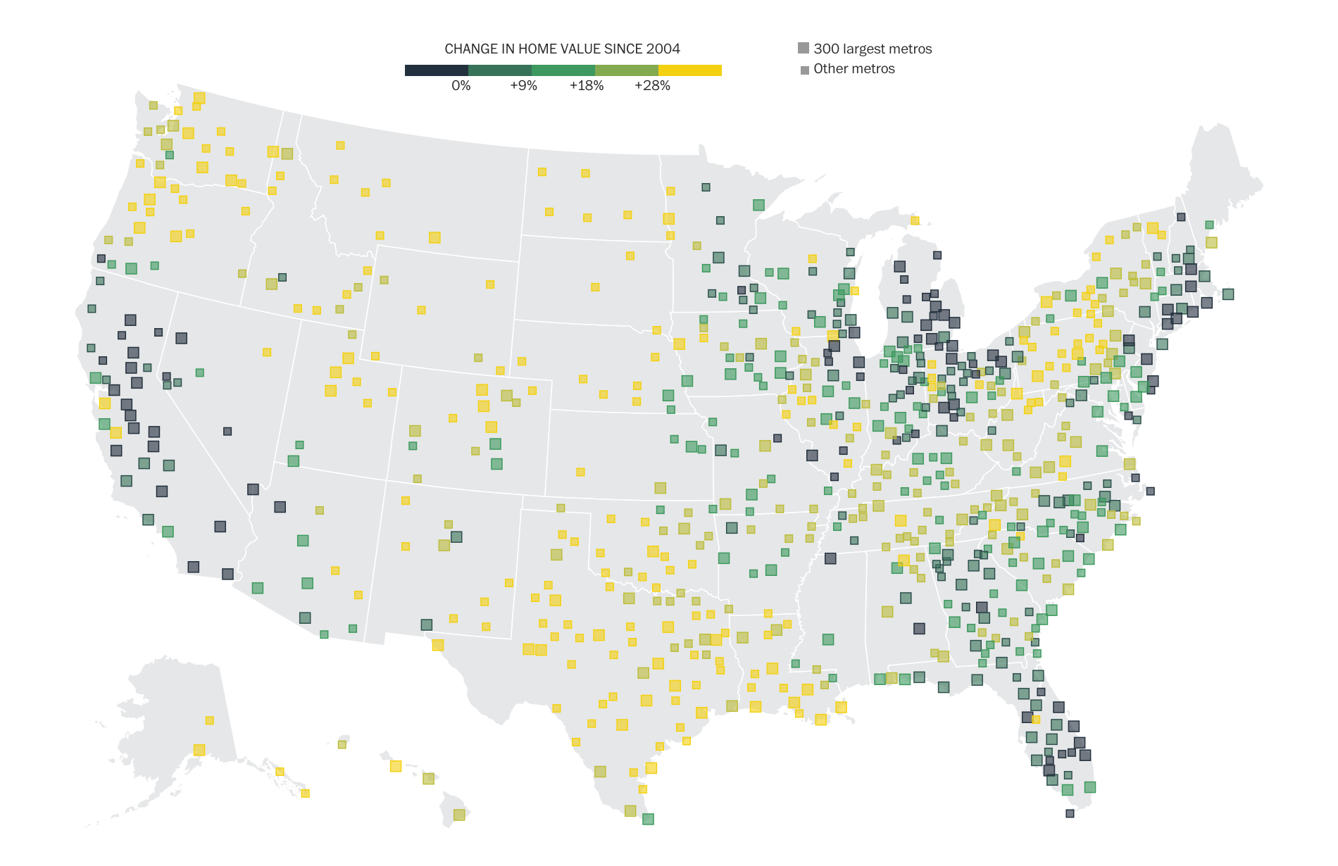
This series about the recovery of the U.S. housing market was instigated by Ted Mellnik, one of our best data reporters. Emily Badger from the Wonkblog came on board and Darla Cameron explored many kinds of visual approaches. Denise Lu took over for Darla when she went on maternity leave and Madia Brown worked on design of the stories that followed the overview.

screenshot-2016-10-06-06-38-01

For digital audiences, we created a geo-focused story with text customized to your zip code, featuring an interactive map of home value changes over the past decade. For print, we combined the Stockton, Calif., story together with the overview of findings that we had online.

Working with our newsletters editor, we created a very successful email campaign that sent emails to readers from the different cities we covered in the series. I love the clean design, simple and intuitive user interface, clear writing and navigation.

Role: Editing, project management, some design and development.

Awards: Finalist for an OJA for Explanatory Reporting; Finalist for Loeb Award, Explanatory Category

Will this storm beat Snowmageddon?

Published in The Washington Post, January 2016

snow

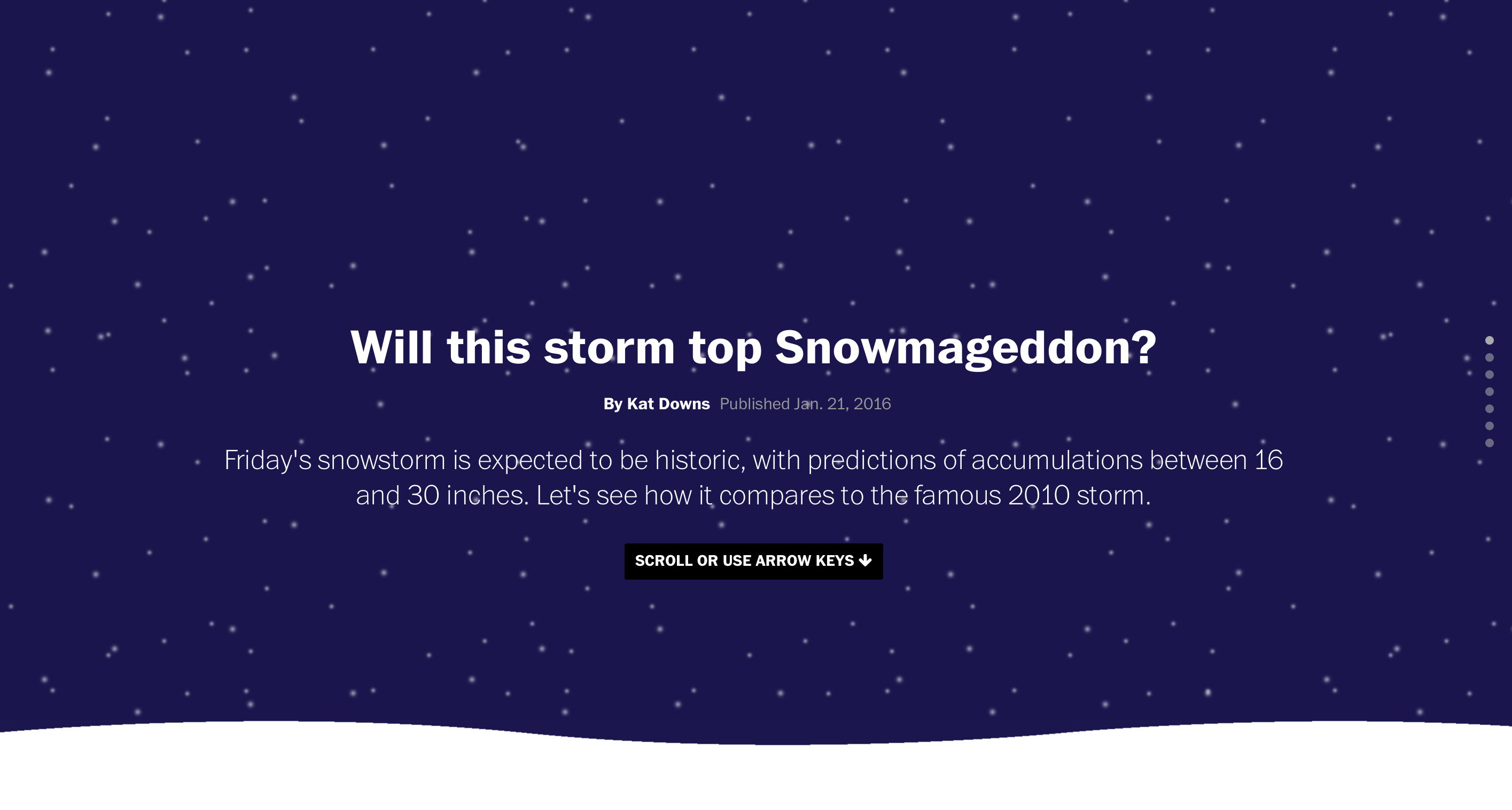
When Snowzilla was looming, I started to wonder whether it was going to be as big as Snowmageddon — the craziest stormstorm I’d experienced in my life. I thought there was a comparison graphic to be done there and as the team was hustling on several other snow pieces (like this, this and this), I decided I would do it. I started it at about 4:30 p.m. and it was up early the following morning.

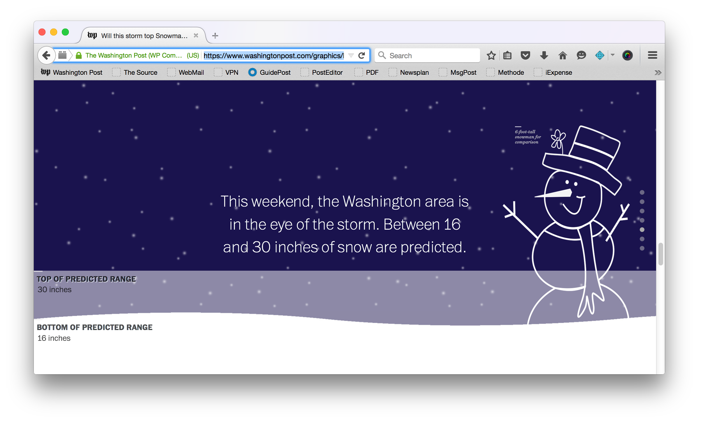
A few months earlier, I had had the crazy idea to use the browser window as a “water tank” to show how drought was affecting California’s reservoirs — Katie Park took that rough concept and ran with it, creating this great graphic that won a silver medal at SND Digital. With the snow coming, I started thinking about how I could compare the predicted snowfall for the upcoming storm with totals from history using the same concept — filling the browser window with the snow.

I figured out how Snowzilla compared, repurposed some of the code Katie wrote for the water piece, learned how to use CSS animations to make snow fall in the background, drew a silly snowman to give scale to the depth of the snow and put this simple piece out into the world.

snowman

If we do something like this again in the future, I’d love to make this run off live data. We could pull in the snowfall totals as they accumulate and animate the “snowflakes” and snow drifts in the graphic so they reflect the storm as it happens.

Role: Design, illustration, development, reporting

Waypoint

Published in The Washington Post, January 2016

Waypoint

Samuel Granados pitched a trip to Lesbos to tell the story of the migrant crisis in a visual way. I thought it was a great idea, we got the room excited about it and Samuel and Zoeann Murphy went to the island and reported this amazing story. When they returned, we had a ton of material to work with and had to spend quite a bit of time crafting the narrative and story structure.

After a lot of whiteboarding and brainstorming with the team, which also included Emily Chow and Kevin Schaul, I suggested doing a “tap essay,” inspired by Robin Sloan’s project Fish. We’d keep the number of slides succinct and we’d also offer readers the chance to go down different offshoots, but always come back to a central narrative. This was my first sketch of the “offshoot” concept (on the far right of the board):
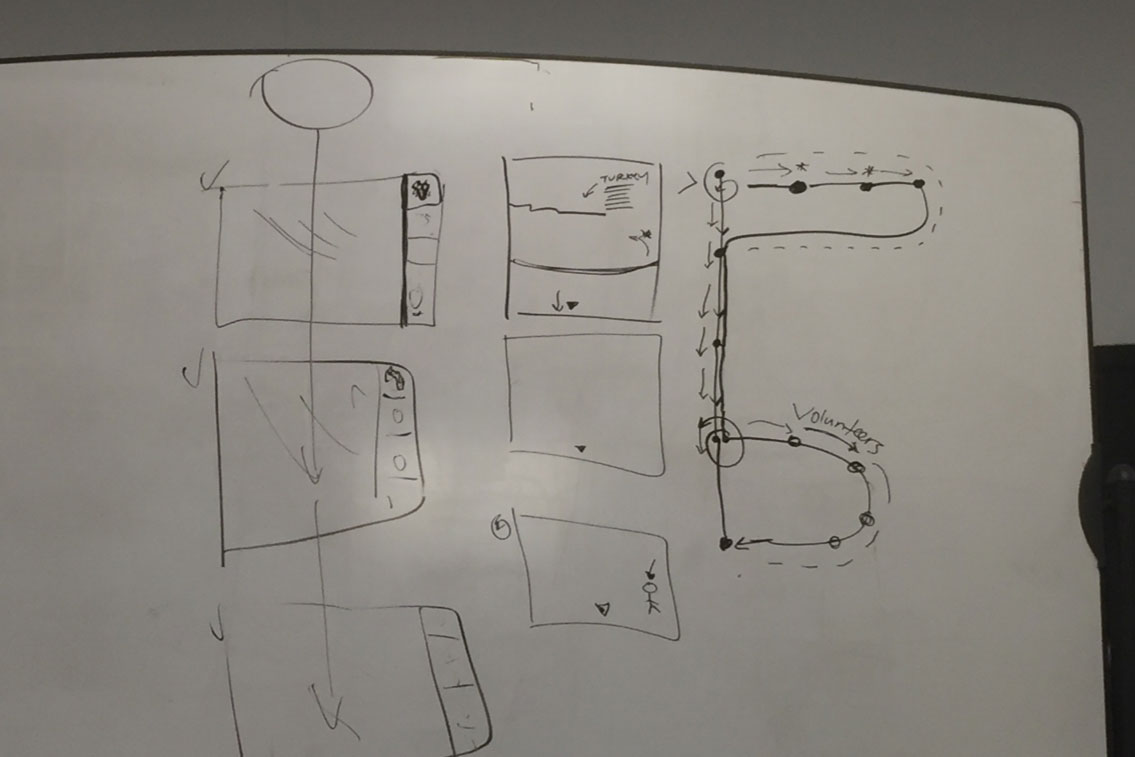
sketches

We decided to pursue that concept and I created a prototype in Keynote, based on Samuel and Zoeann’s notes, visuals, and early narrative constructs, that demonstrated the functionality of the tap essay and the offshoots:
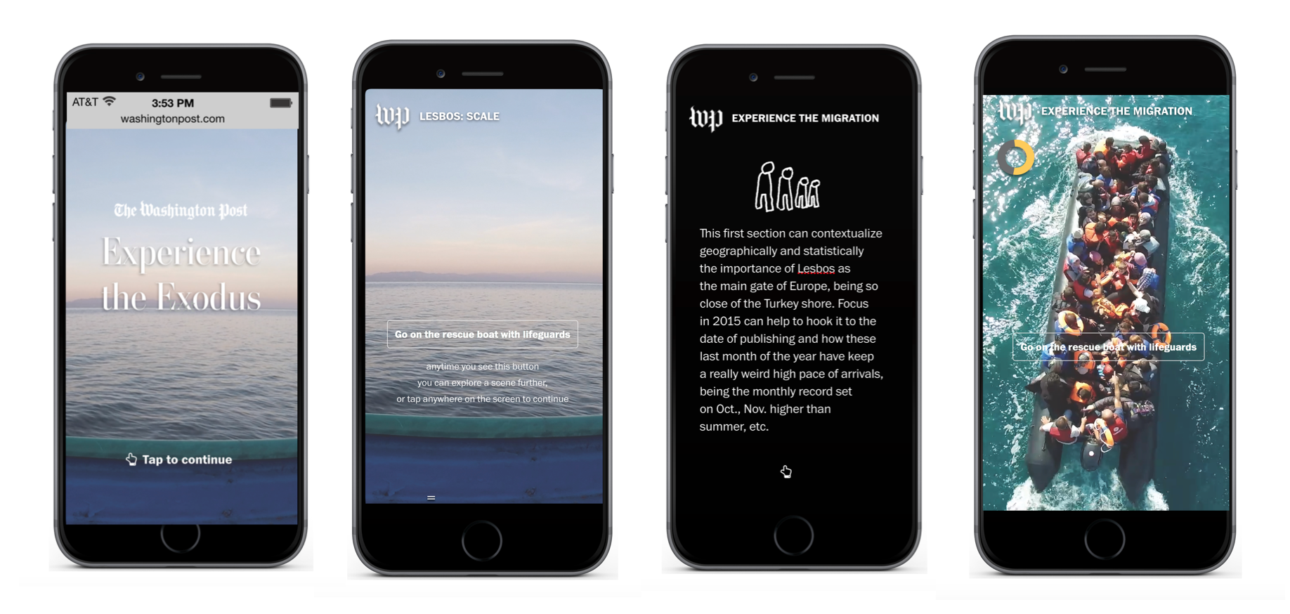
prototype

That very first UI prototype was taken from concept to reality through some truly impressive, smart and endlessly creative work by Samuel, Kevin, Zoeann and Emily, and with some important help from Griff Witte, our correspondent in the area.

We really wanted the experience to feel simple, elegant and powerful. We didn’t want extraneous UI to interfere with the user’s natural behavior as they moved through the story. We had a fantastic completion rate on the project and we found that more than half of people opted in to the offshoots.

This story was an amazing collaborative effort driven by visual reporting. I love how it works beautifully, but differently, on desktop and mobile devices — mostly due to some really smart engineering by Kevin!

The title “The Waypoint” was one of my contributions. I love headlines!

Role: Editing, storyboarding, prototyping, some design and light development.

Awards: National Press Foundation Best Use of Technology in Journalism Award; Pictures of the Year International 1st place in Online Feature Story Editing; White House News Photographers Association Honorable Mention for Best Multimedia Package
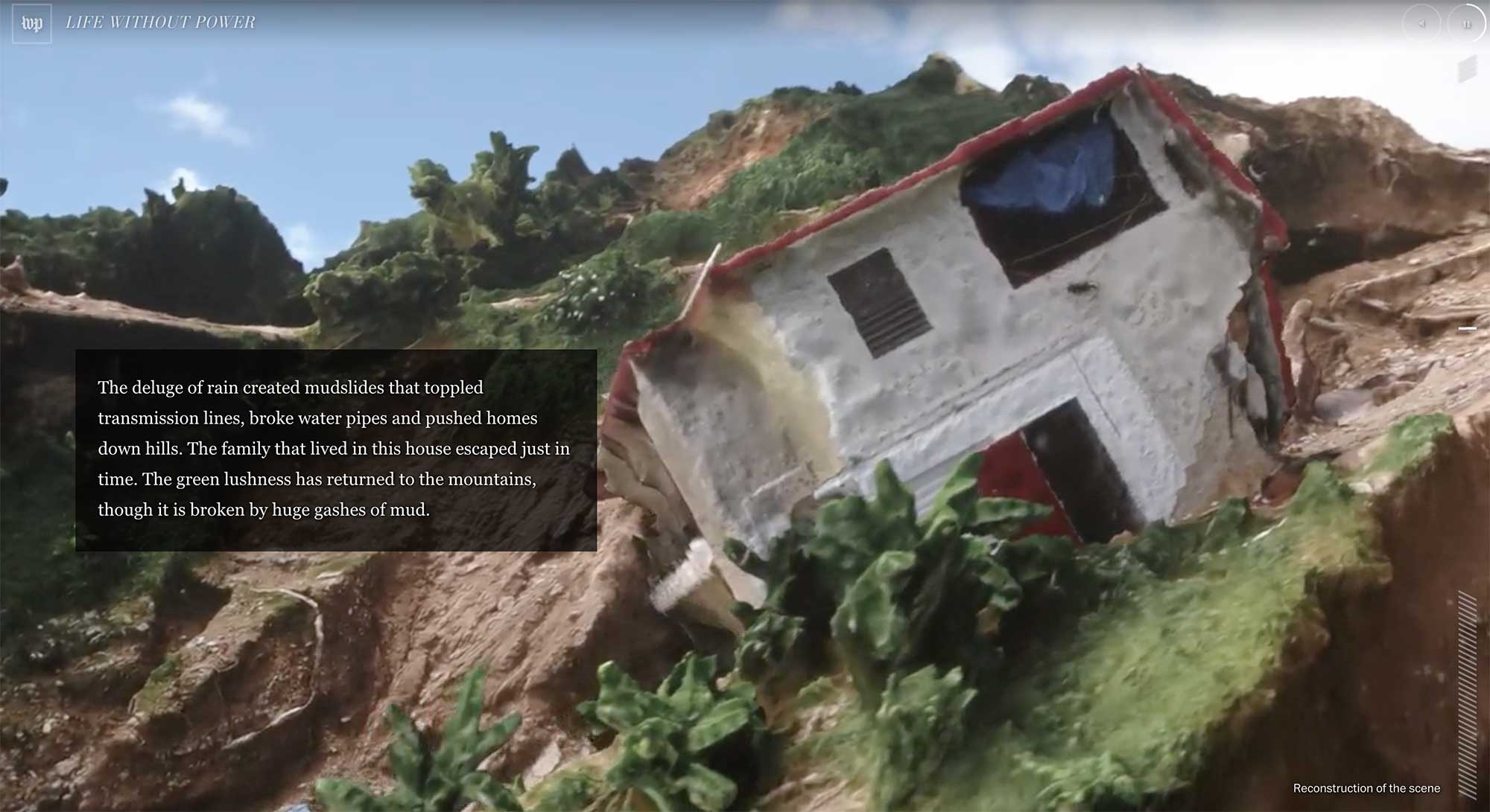
Visual debate deconstructions

Published in The Washington Post, Fall 2015

Screenshot 2015-12-12 22.05.34

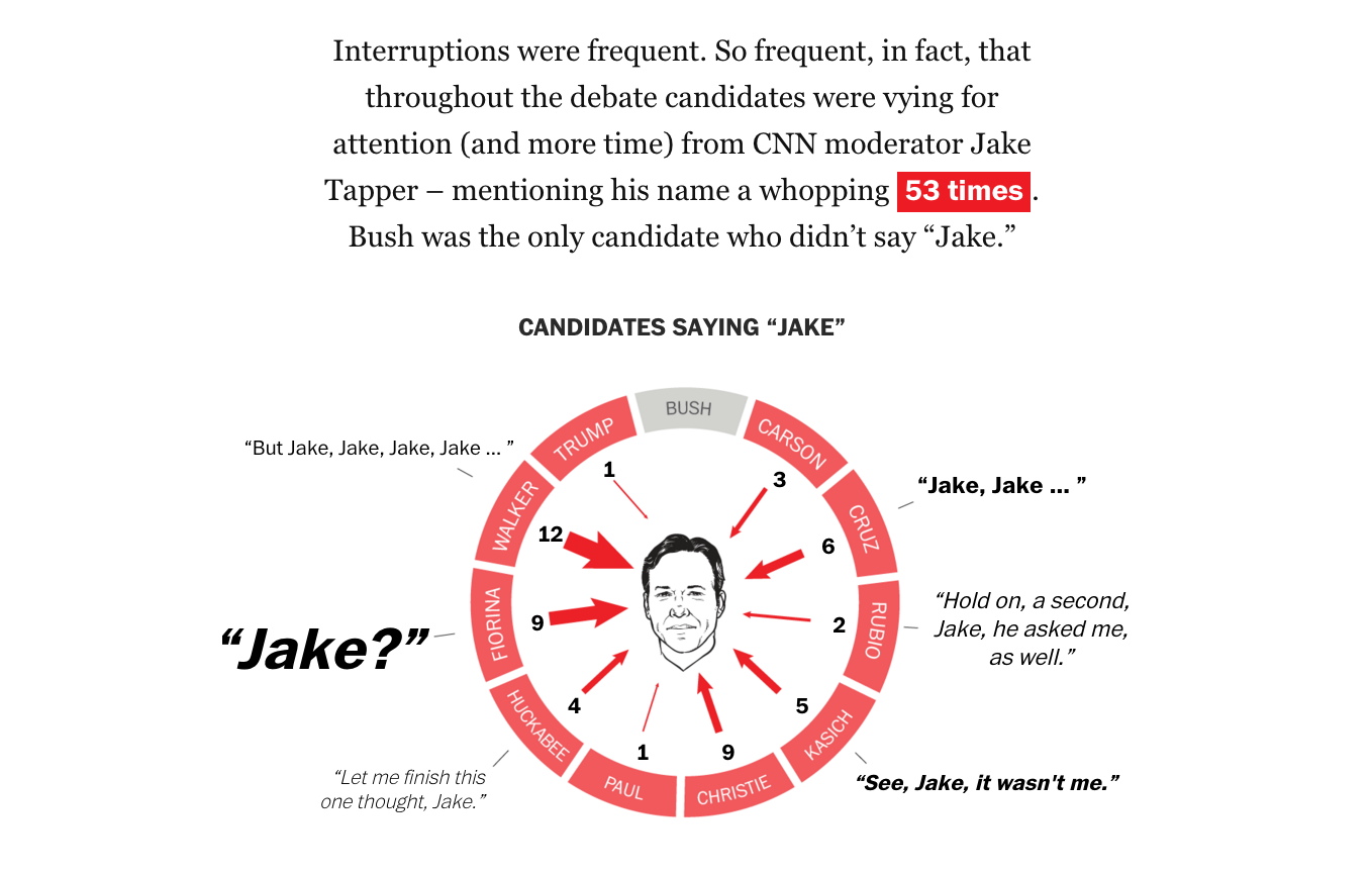
These debate deconstructions have been a fantastic collaboration led by Samuel Granados and have included a bunch of different folks in the team. I love their simplicity, playfulness and visual approach. I’ve helped construct the narratives, design some of the visual elements, and write the text.

Role: Writing, editing, some design (not the example above, Kevin Uhrmacher designed that! But it’s my favorite graphic in the project — hilarious.)

Awards: Award of Excellence in the SND Digital competition

More debate deconstructions: 10 charts explain how Rubio emerged, Bush devolved in third GOP debate, Deconstructing the #demdebate: Clinton, Sanders control conversation