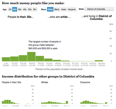
In an extremely quick turnaround, I worked with Dan Keating to create this tool that shows you the breakdown of what other people of your age, race, and location make each year. Hopefully in the future we’ll be able to improve it and add some more metrics, but it’s pretty cool for taking less than a day!
A workout at work and/or my 15 minutes of fame
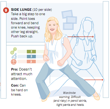
To create this graphic about exercises you can do at the office, the entire graphics department of the Post got together twice a day to do the exercises. It was a hilarious group activity — we attracted a lot of stares from passersby in the newsroom. I really enjoyed jumping around a little bit in the middle of the day to get the blood pumping.
The graphic was a fun collaboration between Laura Stanton, who illustrated many of the department members, Sohail Al-Jamea, who created the animations, Bonnie Berkowitz, who was our exercise leader and researched and wrote all the text and conducted the survey, and me — I helped design and build the interactive and set up the videos and polls.
So far we have had a lot of people voting — about 1,700 for the first exercise. It’s fun to see how people have responded to each exercise, and we’re hoping it is promoting engagement with the piece.
Royal rumors (and some graphics fun)
With Kate and Will back in the news for the rumors about a pregnancy with twins (not true, by the way), I thought, “Hey, what better opportunity to make up for the fact that I never wrote about our royal wedding graphics on the blog?” So here I am. Royal couple junkies, enjoy. And if you’re a true royal wedding fanatic, you might enjoy this video about my roommate, coincidentally also named Kate Middleton (this one is true).
The main piece I worked on was the Westminster Abbey and parade route tour. Sohail Al-Jamea and Alberto Cuadra worked together on the 3-D renderings and animations, and I layered on the interactivity and created the Google Earth flyovers and, with help from Laris Karklis, the parade route maps and Street View layers.
Analyzing the U.S. tax code, break by break, and other recent charts
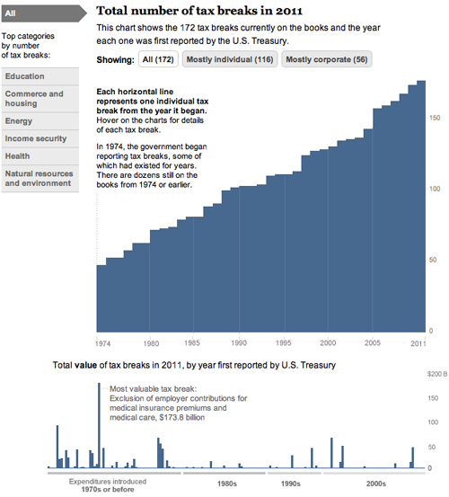
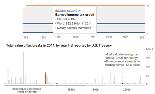
Today, we came out with a new graphic that looks at the tax breaks on the books this year. It is part of Running in the Red, a series the Post has been running for the past few months, and accompanied Lori Montgomery’s front-page story, “Ever-increasing tax breaks for U.S. families eclipse benefits for special interests,” a great story that explains spending through the tax code.
The graphic is all CSS and JavaScript. With charts that only have bars, it’s simple to dynamically add sized divs with background colors that create charts. The data will update automatically if necessary and it works across all browsers and mobile platforms with no workarounds:
And has details for each of the 172 breaks currently active (see below). Added bonus: I learned a ton about the tax code.
And a couple more (relatively) recent charts:
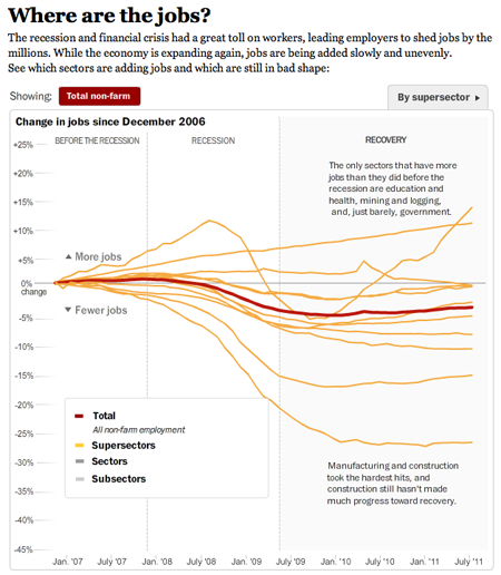
This one I worked on with Alicia Parlapiano and Neil Irwin. Because I wanted to create animate transitions and interactivity, I used Flash to create this graphic. It has detailed drilldowns to look at employment in each sector of the economy. I tried to inject more annotation into this graphic (and the taxes one above) than we have done in the past with data-driven graphics. Instead of throwing a bunch of data out there, we’re providing more context and guided views — by category and by sector versus a completely self-guided data dive.
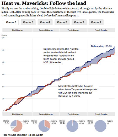
This was a fun chart I helped our intern, Heather Billings, with at the beginning of the summer. We used flot to make these charts showing how the lead changed between the Heat and the Mavericks during the NBA finals. This was particularly fun for me because I got really into the NBA finals this year and watched every game. I know, hard to believe, but true. I was a having a great time analyzing the outcome of the games and reading all the news — and if you missed it, this was a great article from Bill Simmons at Grantland.
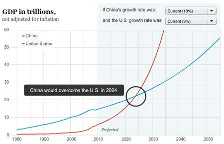
And another one about when and if China’s economy will pass the United States to become the world’s largest.
iPhone photography
My first shot at iPhone photography. I found it really fun — I love the filters and the size of the phone makes it easy to carry around. I was mostly using Hipstamatic and Instagram, and shot a few panoramas with the Photosynth app. To see the full gallery, go here.
Most of these were taken in New Hampshire (Lake Winnepesaukee and Portsmouth), Boston, and Hendersonville, N.C. Here’s a shot of Mt. Major near Alton Bay, N.H. Click the image to enlarge.
Coming home a different person
Published in The Washington Post, October 3, 2010
Role: Design, programming, production
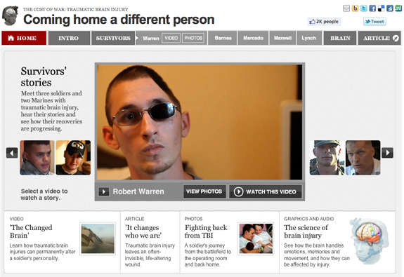
I worked closely with Whitney Shefte and Alberto Cuadra to create this piece. We storyboarded the intro video, motion graphics segments, and the flow of the piece together, then each created the individual parts. I built the interactivity around the intro page menu, the brain segment, and the package navigation. It features deep linking to each video, gallery, or multimedia segment.
Tools used: Flash/ActionScript 3.0 with audio and video players, Javscript, CSS, SWFAddress by Asual, Adobe Photoshop
Awards: POYi Documentary of the Year, Peabody Award (2010), Online Journalism Award for Multimedia Feature Presentation (large site), Finalist for the Pulitzer Prize for Explanatory Reporting, SND Digital Design competition (Use of Multimedia), WHNPA Eyes of History 2011: 1st Place for Multimedia Package (In-Depth) and 2nd Place for Multimedia Innovation
Is life getting better or worse?
Published in The Washington Post, October 30, 2011
Role: Design, programming
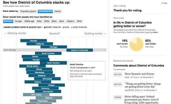
I worked with Dan Keating (database) on this project, which takes a unique approach to user-generated data. It mashes up responses from users with actual numbers on unemployment, median income and population growth to see how people’s perceptions line up with reality. A week after launch we had nearly 5,000 responses. We use IP location to target the experience to the user’s county and state, and ask them to make a rating and, optionally, give us some demographic information and leave a comment. Read more here.
Tools used: JavaScript, jQuery, Quicksand plugin, Echo comments API, Google Visualization API, Bit.ly API, CSS
More user-centered projects: Are you over the hill for Olympic sports?, How does your income compare?
Moving away from Flash: A look at JavaScript drawing libraries
Excerpts from a new post for WP’s @innovations blog:
[Go to the blog to read the whole thing]
When Apple announced early last year that it would not support Flash on the iPhone and iPad, a passionate conversation erupted in the world of web development: Was Flash dead? If not, how would it survive? When should it be used? News developers asked these questions as well, and, at least in our newsroom, the conversation inspired some thinking about how to approach interactive development. Over the past year and a half, there has been steady movement toward more interactivity based on JavaScript and fewer Flash-only experiences.
Last week we published a graphic that compared four federal budget proposals through a series of charts. We used the jQuery library Flot to draw simple, interactive line charts that showed how the debt and deficit would change under the different plans. Flot is very easy to use, flexible and customizable, and is one of many free-to-use JavaScript graphing libraries out there (Dracula, Highcharts and RGraph are a few others). We also built a customized chart with CSS and JavaScript at the bottom of the page to show how different categories of spending would be affected.
Recap from Malofiej 19

In March, I set out for Pamplona, Spain, to join the jury of Malofiej 19. For three days, we judged hundreds of entries in the digital contest, while colleagues on the print side saw over 1,000 entries. Check out the awards here.
Other jury members came from all over the world — Germany, Argentina, Chile, Spain, Italy, and the United States. I met a ton of awesome people who share a passion for infographics and alternative forms of storytelling. Gert Nielson keeps a good log of the goings on at his blog, Visual Journalism. Kaitlin Yarnall of National Geographic wrote a summary piece for the Society of News Design blog here. Javier Errea, who organizes the event, also wrote a post on his blog (in Spanish).
I really liked Stephen Few’s presentation on Infographics and the Brain — reminding us all to think not only of how we want to present the information, but how it will be perceived. It doesn’t matter how good it looks or how clever we think it is if it misses the basic point: helping people understand information.
I gave my presentation on the power of using social media and user-generated content in graphics. I focused on two types of input — that which comes directly from our users (games, polls, submissions) and that which comes from existing social networks (facebook, twitter, foursquare, flickr). The amount of information out there is incredible, and we have to figure out how to use it in ways that show how people fit into their world. The opportunities are endless. Recently some interesting projects have come out that harness some of that power, including the Wall Street Journal’s Foursquare project, a look at check-ins over a week’s time in New York and San Francisco, and the New York Times Bin Laden emotion grid.
For more photos from Malofiej, go here.
Global Warning
A full five months after wrapping the Global Warning project, I think it’s time to do a blog post about it! I spent last fall working with a team of students on a National Security Reporting project at Northwestern University’s Medill School of Journalism. I was an adjunct professor, teaching the students multimedia design and light programming, and serving as the design lead for the project, which was led by Ellen Shearer and Josh Meyer.
After spending a couple of months in the discovery and ideas phases, we decided on several graphics that would address the main topic of the project: How could climate change affect national security?
