The Cost of War

TBI Menu

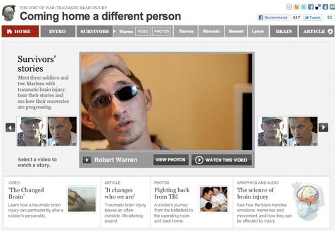
This past Sunday “Coming home a different person” launched, a project I worked on with Whitney Shefte and Alberto Cuadra, alongside reporter Chris Davenport. It features an overview video that covers the increases in traumatic brain injury cases and what doctors are doing to treat it, as well as five case studies of three soldiers and two Marines, and a graphic that explains the science of brain injury.

I initially heard about the story Chris Davenport was working on and thought, wow, this is an amazing multimedia opportunity. I went to Whitney and asked her if she’d like to work on it with me. We huddled with Chris and storyboarded out a basic flow for the intro video and the entire piece — how it would be structured and how we should integrate the graphics with the videos. Read more about how we developed this multimedia piece »
Alternative story formats: Investigation into Alaska native corporations

Two Worlds
Two Worlds

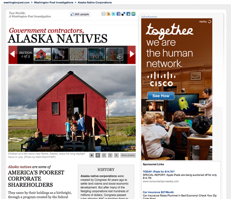
This investigation, which launched September 30, focused on Alaska Native Corporations and their explosive growth during the last decade. I combined photos, graphics and video in a multimedia slideshow. The intention was to build a relationship between the corporations and the shareholders they represent. Alaska natives are some of the nation’s poorest people, and some of the corporations that were supposed to be helping them make their way have instead been funneling money back to contractors in Washington.

Read more and see screen grabs »

Live results widget

Primary Results Widget

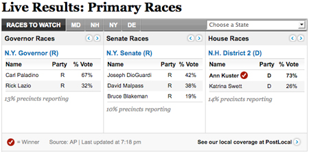
In preparation for the September 14 primaries, I designed this widget for the Politics front. It features house, senate and governors races that auto advance, as well as races to watch, and allows you to see all the races in one convenient spot. It was actually built out by a contractor, Zvi Band of SkeevisArts. We used it on the politics front as the live results came in, and will be able to re-purpose it for future elections.

Liquor sales and consumption

Liquor sales

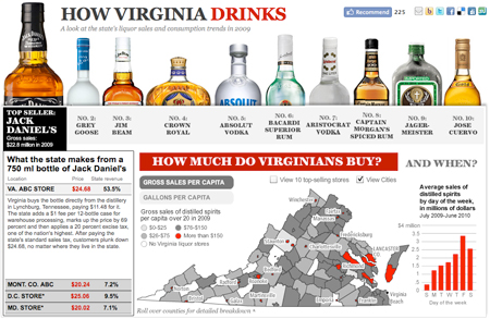
This piece on liquor sales and consumption in Virginia features the 10 top-selling liquors in the state, as well as a tax breakdown and a map showing which areas are purchasing the most liquor. I think looking at the top sellers is interesting — to see that Aristocrat sold more than Jose Cuervo or Captain Morgan. It was a quick-turnaround, fun piece that paints a picture of how Virginia drinks.

Path of a predator

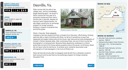
Timeline of Kevin Ricks' teaching career

After a long week & weekend of wrapping up the Top Secret America project, we hit the ground running with a project that came out today about local teacher Kevin Ricks. A four-month Washington Post investigation of his career revealed a pattern of abuse that goes back to at least 1978 and has a trail of victims that spans the globe. Reporters Josh White, Jennifer Buske, Michael Chandler and Blaine Harden worked on the story, which was just a great piece of reporting. Go read it!

The timeline tells the story through each place Ricks has been, including maps and a list of schools where he worked in each place. It also has audio clips from a hearing where a German student tried unsuccessfully to get a restraining order against Ricks, and myspace messages that Ricks wrote.

This graphic was done using jQuery and CSS. It uses the ColorBox jQuery plugin for the lightbox effect. The audio players are the only Flash pieces in the project — they’re standard across the site (I built them about a year ago). So check it out on your iPad 🙂

Top Secret connections

After a full year of working on various aspects of the Top Secret America project, we have finally launched! Check out the full project at topsecretamerica.com.

Network connections: Who's involved in the most types of work?
Who's involved in the most types of work?

I worked on a whole bunch of aspects of this project and did a lot of brainstorming and storyboarding, but my primary focus was the interactive “network connections” graphic. In the beginning we wanted to create a graphic that illustrated the redundancy and size of Top Secret America and had a ton of data in it, while not being overwhelming. Read more »

A look at the life of an alleged spy

The spy next door?
The spy next door?

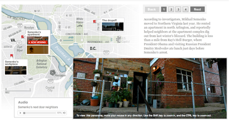
Last week, after the news broke that one of the 10 alleged Russian spies arrested by the FBI most recently lived and worked in Arlington, Va., Ben de la Cruz came up with the idea to do some panos of the scenes where the alleged spy lived his life. We talked through how we’d like to present it and how the story would flow through the audio and panos. Then Ben worked with Alex Garcia to shoot and stitch the panos and he wrote and recorded the narration. I put together the piece in a slideshow format, with audio and a pano for each location on the map. It took about 6 hours of my time to put together. It’s a nice little piece that’s a window into the life of a spy — something we’re all very curious about.

Arbor Day Trees Map

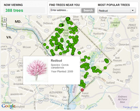
We published this graphic for Arbor Day, which was on April 30. It takes a look at all the trees that have been planted by the non-profit organization Casey Trees since 2003. They’ve planted thousands of trees in order to try to increase D.C.’s “urban canopy.” You can use this tool to see where they’ve planted trees in your neighborhood and what kind they are.

Redbud Trees in DC

From a technical standpoint, this project was really interesting. It was executed in about two days, so it was a really quick turnaround, considering I haven’t done extensive development with the google maps api. Nathaniel and Gene worked up some cool custom tiles, and I designed and programmed a lot of it, and fit all the pieces together. Keep reading this post »

2010 Political Race Maps: House, Senate and Governors

2010 Campaign: Congressional Races

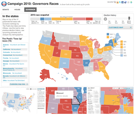
These three new race maps (house, senate, and governors) launched today with the new PostPolitics section of The Washington Post. I worked with Karen Yourish and Dan Keating, who are absolutely amazing data whizzes, to get the data together for the project, and Nathaniel Vaughn Kelso gave me some great base maps to start with. We really wanted to give a complete picture of the 2010 races, so we have current race ratings (for house, we have state of the race), election history for each district or state, and demographic information that lets you see some cool patterns — like how states vote when they have a high percentage of seniors or high poverty rates. Keep reading this post »