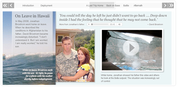
The Battle of Wanat

Published in The Washington Post, October 3, 2009

The Battle of Wanat

For this story about a battle in a remote part of Afghanistan that had greater implications for the war there, reporter Greg Jaffe came to us with a ton of found videos, photo and audio. I came up with the idea to do a horizontal pane timeline that would allow us to integrate all the media into one experience instead of breaking it up into several pieces. I built this horizontal scrolling interface, which has video and audio players embedded in it. I also designed and laid out all the photography and text in the piece. I think it has a simple and easy user interface, which drives interaction with the multimedia items inside the project.

Role: Design, programming

Tools used: Flash/ActionScript 3.0 with audio and video players, Adobe Photoshop, CSS

Awards: Bronze, Malofiej 18; WHNPA Eyes of History 2010: 2nd place for Best Multimedia Package (Simple); SND Quarterly (Winter 2009)
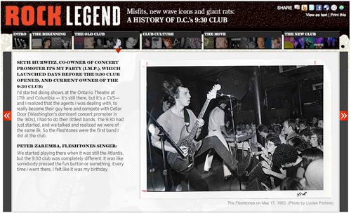
D.C.’s rock scene: 9:30 club turns 30

A multimedia history of the 9:30 club

I spent the last few days working on this piece about the 30th anniversary of the opening of the 9:30 club, one of the best venues in D.C. (and a lot of people would say the whole country). Alex Garcia shot some great concert video and interviewed some key people, and Josh du Lac wrote the magazine story. I pulled it all together in this multimedia slideshow, which has several different text layouts and video in varying sizes. The content of this is the coolest part — there are some great stories in there about the old club: how there were so many rats they had something called the “rat highway,” how Will Smith (The Fresh Prince) showed up and just left without playing the show because he was so disgusted at how the place looked and smelled, and a whole bunch more. There are also some great photos from the ’80s and ’90s. I pulled the illustrations from the magazine layout, which you can see here.

Say What?

Published in The Washington Post, August 2012

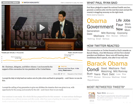
I have been wanting to do a Twitter project for a while, and this time all the pieces fit together. After I pitched the idea, Cory Haik coordinated a partnership with VoterTide, a great company in Omaha that does aggregation and analysis of Twitter trends specifically around politics, that made the Twitter analysis segment possible. I designed the piece, and we were able to get two awesome developers, Leslie Passante and Jeremy Bowers, to build it. My favorite things are the ‘watch highlights’ view, where you can see all the Post analysis and skip everything else, and the addition of the social layer. Read more on my blog.

Role: Design

Related: Debate version!

In the news: Poynter

New county map: Ultra-high Medicare Billing Rates

Billing Medicare at the highest rates

I re-purposed the unemployment map for this story about ultra-high billing rates at skilled nursing facilities in the U.S. It shows where facilities are billing ultra-high rates. The Washington Post found that nursing homes have flooded ‘ultra-high’ billing categories with patients, and the amount of waste and abuse could reach billions of dollars a year. Check out the graphic or read the story by Scott Higham and Dan Keating.

New project: Graphic explains the search for a serial rapist

Rapist's trail spans four states, 13 years

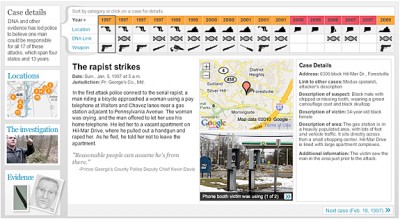
I worked on this graphic with reporters Josh White and Maria Glod, who collected an incredible amount of information on the East Coast Rapist, a man who has been on the loose for 13 years and is a suspect in 17 cases. For this important story, I organized the data that Josh and Maria collected into an easy-to-use interface that had the details of each case, including a small photo gallery, a google map, a quote and all the case information. I built an interface that drew connections between the cases and allowed people to sort the cases by date, location, existence of dna samples, and the weapon used. It also featured a map interface, a gallery and a video. Keep reading this post »

Fact or Fiction

Published in The Washington Post, December 2011

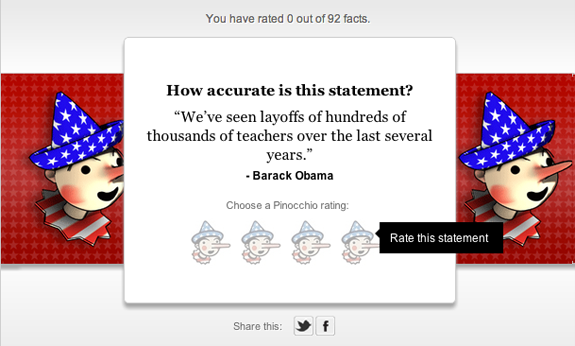
This card game is a fun way to expose all our Fact Checker columns. People can choose their own ratings and see past ratings for candidates. I designed and developed the main game, as well as the widgetized version of it that lives in the politics section.

Role: Design, programming

Tools used: Javascript, CSS

More games: D.C. Budget Game, Make a royal match, How well are you aging?, Washington Metro art

Analyzing U.S. tax breaks

Published in The Washington Post, September 18, 2011

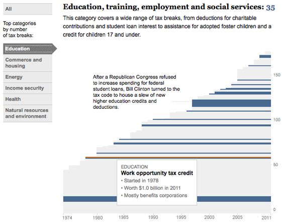
This piece looks at all the tax breaks on the books in the United States, how much they cost and when they went into effect. It breaks down all the tax expenditures by category and value and highlights important movements. I created the charting, interaction and design of the javascript visualization at the top of the page. We focused a lot on adding an annotation layer to this piece, so it’s not just a deep data dive. While the granular information is there, it is secondary to the analysis we are providing. Read more here.

Role: Design, programming

Tools used: JavaScript, jQuery, CSS

More charts: Where are the jobs?

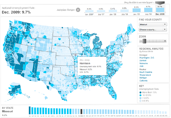
Unemployment map

Published in The Washington Post, December 3, 2009

Unemployment by County

This map shows the change in unemployment rate over time on county, state and national levels. This was a quick-turnaround project — the initial version was done in two days, with about three days of upgrades. I imported simplified county shapes into Flash, and built all the functionality and the interface, which includes charting for U.S. and state unemployment rate. It also has historical unemployment data that lets users go back and see how their county has fared for the past two years. It features zooming and panning, as well as quick-select menus on the right side. We’ve also highlighted certain regions, so when you click on those you get a detailed analysis and a zoomed in view.

Role: Design, programming, research

Tools used: Flash/ActionScript 3.0, MaPublisher

Awards: SND Quarterly (Winter 2009)

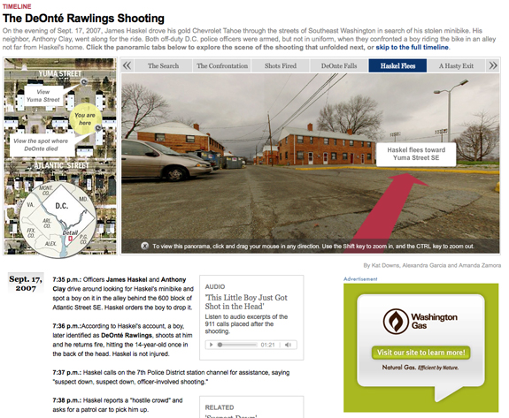
Rawlings Panoramic Timeline

Published in The Washington Post, April 18, 2009

rawlings timeline

This project recreates the scene where DeOnte Rawlings was shot, and tries to lend clarity to what happened (there was debate about whether police had reason to shoot at him or not). Alex Garcia had shot some panoramas of the scene, so instead of just having them in a gallery, I suggested that we try to create a 3-D crime scene timeline, by using Flash Panorama Player’s hotspot technology. I had only used it once before so it took some time to set up, but I really like the effect. It gives a great sense of place and is a really powerful storytelling tool.

Tools used: Flash/ActionScript 3.0 and Flash Panorama Player, CSS

Role: Design, programming

More of my panorama projects:
Egypt Panoramas (panorama template)

More investigative design:
Two worlds, On the trail of a serial rapist, Fatal flights