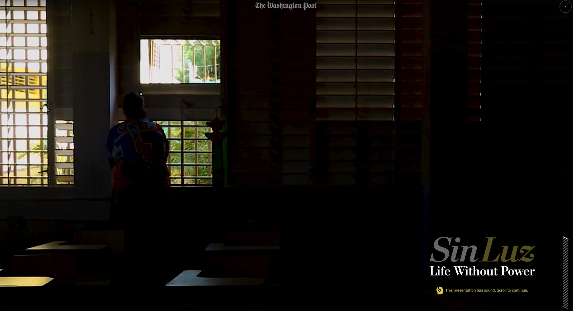
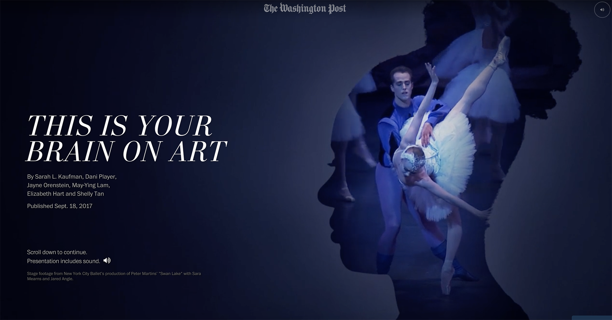
Sin Luz

Published in The Washington Post, December 2017


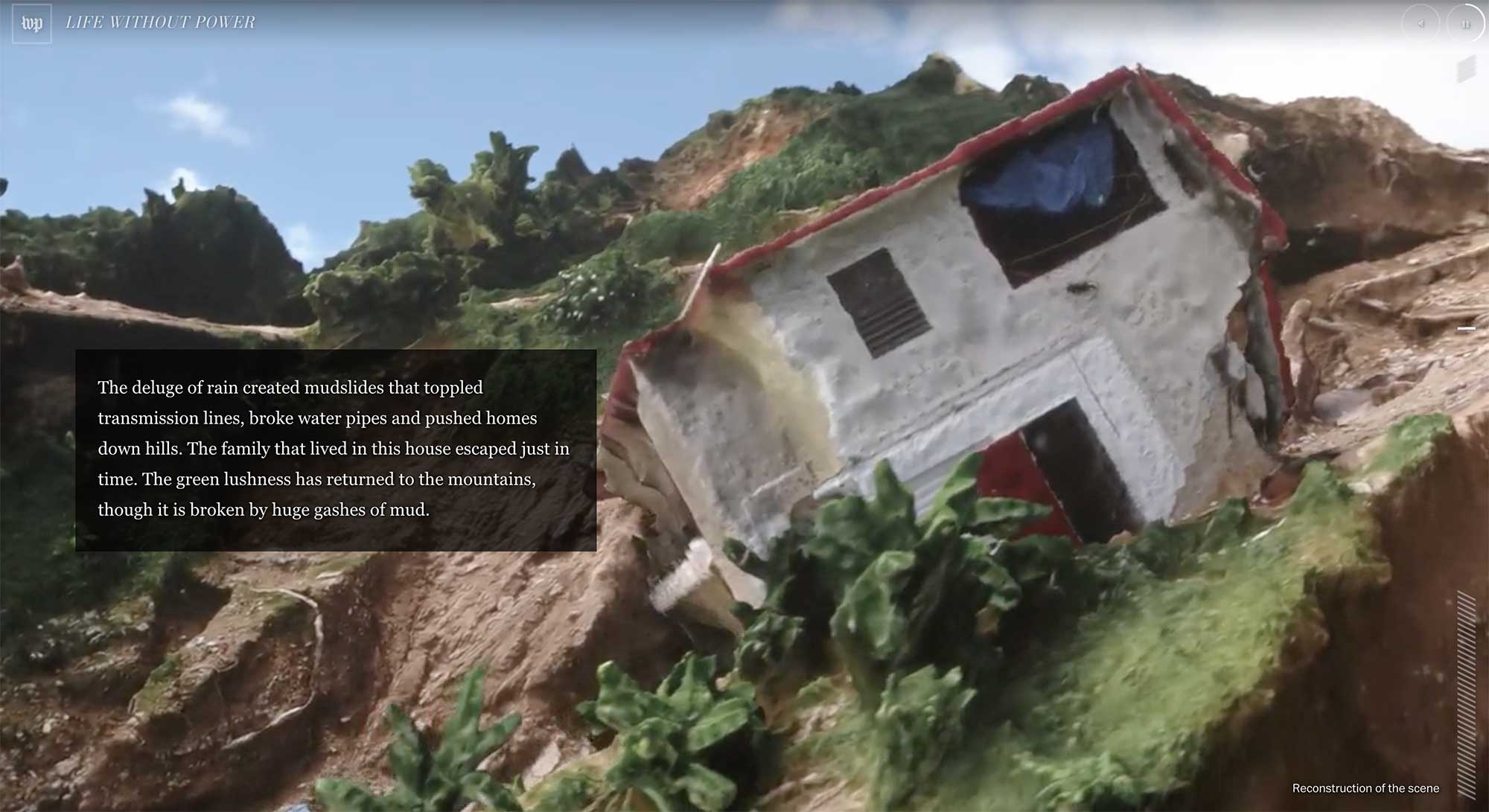
I was a lead editor and project manager on this story, which showed the difficulty of life without power after Hurricane Maria devastated Puerto Rico, and the resilience of the Puerto Rican people as they dealt with the challenges.

Sin Luz

In addition to smart user interface design and an incredibly powerful story, we created 3-D terrain maps of the island and used photogrammetry and drone footage to recreate the scene.

Role: Editing, project management

Awards: World Press Photo, Immersive Storytelling, second prize

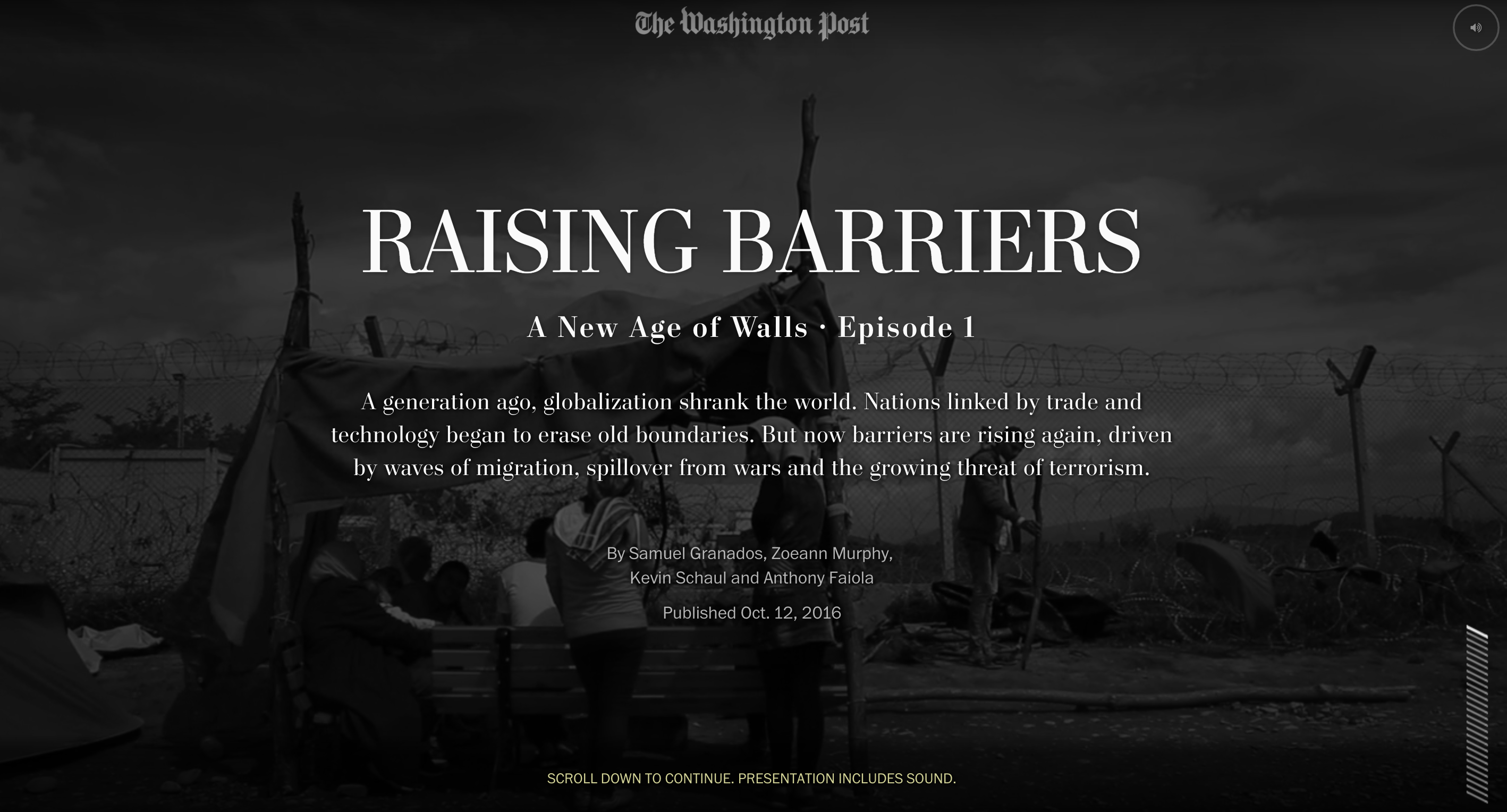
A New Age of Walls

Published in The Washington Post, October 2016

A New Age of Walls

I was the lead editor and project manager on this 3-part series, which explained the rise of barriers worldwide as a means of preventing migration and providing border security. It explored their effectiveness and impact in a deeply compelling narrative that melded text, video and graphics in ways we haven’t tried before. My team led the field reporting in collaboration with foreign correspondents, and I led the editing team, which also included a video editor and the foreign editor.

Role: Editing, project management, storyboarding, prototyping

Awards: Malofiej International Infographics Awards Human Rights Best Graphics Award and Gold medal in features category; Gold medal in the Society of News Design digital awards; Finalist for a Webby award; White House News Photographers Association, First place in Best Multimedia Package; First prize in Innovative Storytelling in World Press Photo’s 2017 Digital Storytelling Contest, Emmy nomination in Outstanding New Approaches: Documentary, and OJA finalist in Excellence and Innovation in Visual Digital Storytelling

In the news:
Washington Post series on border barriers aims to break the mould of digital storytelling (Journalism.co.uk)
If you dream big, you can redefine the way we tell stories in the digital age (The Washington Post on Medium)

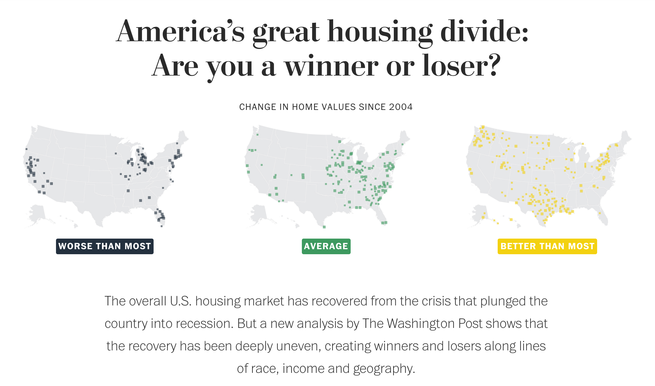
America’s Great Housing Divide

Published in The Washington Post, April 2016

Housing

This series about the recovery of the U.S. housing market was instigated by Ted Mellnik, one of our best data reporters. Emily Badger from the Wonkblog came on board and Darla Cameron explored many kinds of visual approaches. Denise Lu took over for Darla when she went on maternity leave and Madia Brown worked on design of the stories that followed the overview.

screenshot-2016-10-06-06-38-01

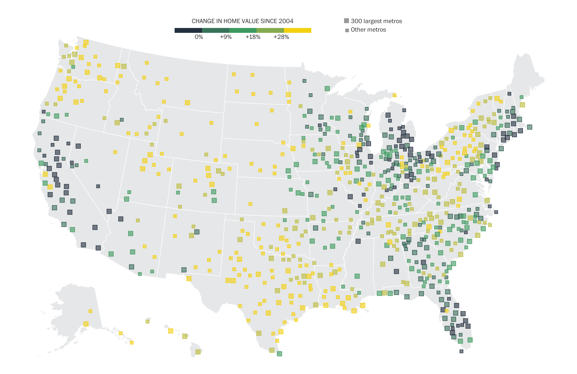
For digital audiences, we created a geo-focused story with text customized to your zip code, featuring an interactive map of home value changes over the past decade. For print, we combined the Stockton, Calif., story together with the overview of findings that we had online.

Working with our newsletters editor, we created a very successful email campaign that sent emails to readers from the different cities we covered in the series. I love the clean design, simple and intuitive user interface, clear writing and navigation.

Role: Editing, project management, some design and development.

Awards: Finalist for an OJA for Explanatory Reporting; Finalist for Loeb Award, Explanatory Category

Say What? Interactive transcript player tool is a new way to tell speech stories

Ryan speech

Yesterday, we launched a new project: an interactive transcript player that matches up the words of the speech, Post analysis, and reaction from Twitter.

I have been wanting to do a Twitter project for a while, and this time all the pieces fit together. After I pitched the idea, Cory Haik coordinated a partnership with VoterTide, a great company in Omaha that does aggregation and analysis of Twitter trends specifically around politics, that made the Twitter analysis segment possible. I designed the piece, and we were able to get two awesome developers, Leslie Passante and Jeremy Bowers, to build it.

My favorite things are the ‘watch highlights’ view, where you can see all the Post analysis and skip everything else, and the addition of the social layer. Here’s an excerpt from the ‘Ask the Post’ blog post we put together on it:

… VoterTide will provide user reactions as they happen on Twitter, and we’ll match that to the moment in time these reactions occurred during the speech. We will package these reactions to reveal insights into the nation’s response to the conventions and their most-watched speeches.

We’ve gotten some great reaction from this project on washingtonpost.com and on Twitter. It was also written up by Poynter:

So as the GOP nominee took to the podium and the president prepares to do the same at next week’s DNC, it is appropriate that journalists roll out the coolest newest thing. The Washington Post did just that.

“Some innovations we have done, you step back and say, ‘That was fun.’ And some you might say, ‘We produced a new story form.’ But this time I think we can say both,” Haik said.

Totally agree! And we just did another one for Mitt Romney’s speech. This project would not be possible without the awesome producers who put it together: Haley Crum and Mary Keister. Check it out!
The power of the crowd: Is life getting better or worse?

An excerpt of my post about our new project on the WP innovations blog:

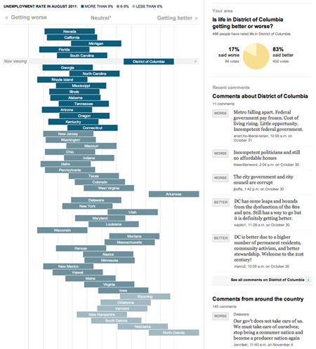
This is one of the first projects to take users opinions and mash them up with actual data to see whether perceptions match up with reality. It’s a fascinating window into how people feel about the places where they live and a forum for a conversation around how things are changing.

There are already some patterns emerging. We are starting to see that, in general, more states with high unemployment are being rated ‘worse’ by users, and more places with low unemployment are being rated ‘better’.

D.C. stands out – though unemployment is high, 83 percent of users (as of publication of this post) ranked it better. One left a comment after rating it ‘better’: “DC is better due to a higher number of permanent residents, community activism, and better stewardship. Welcome to the 21st century!” The comments on why people voted the way they did have been some of the most interesting results of the project we’ve seen so far.

Read more of this post at @innovations »

Global Warning

A full five months after wrapping the Global Warning project, I think it’s time to do a blog post about it! I spent last fall working with a team of students on a National Security Reporting project at Northwestern University’s Medill School of Journalism. I was an adjunct professor, teaching the students multimedia design and light programming, and serving as the design lead for the project, which was led by Ellen Shearer and Josh Meyer.

After spending a couple of months in the discovery and ideas phases, we decided on several graphics that would address the main topic of the project: How could climate change affect national security?

Read more…