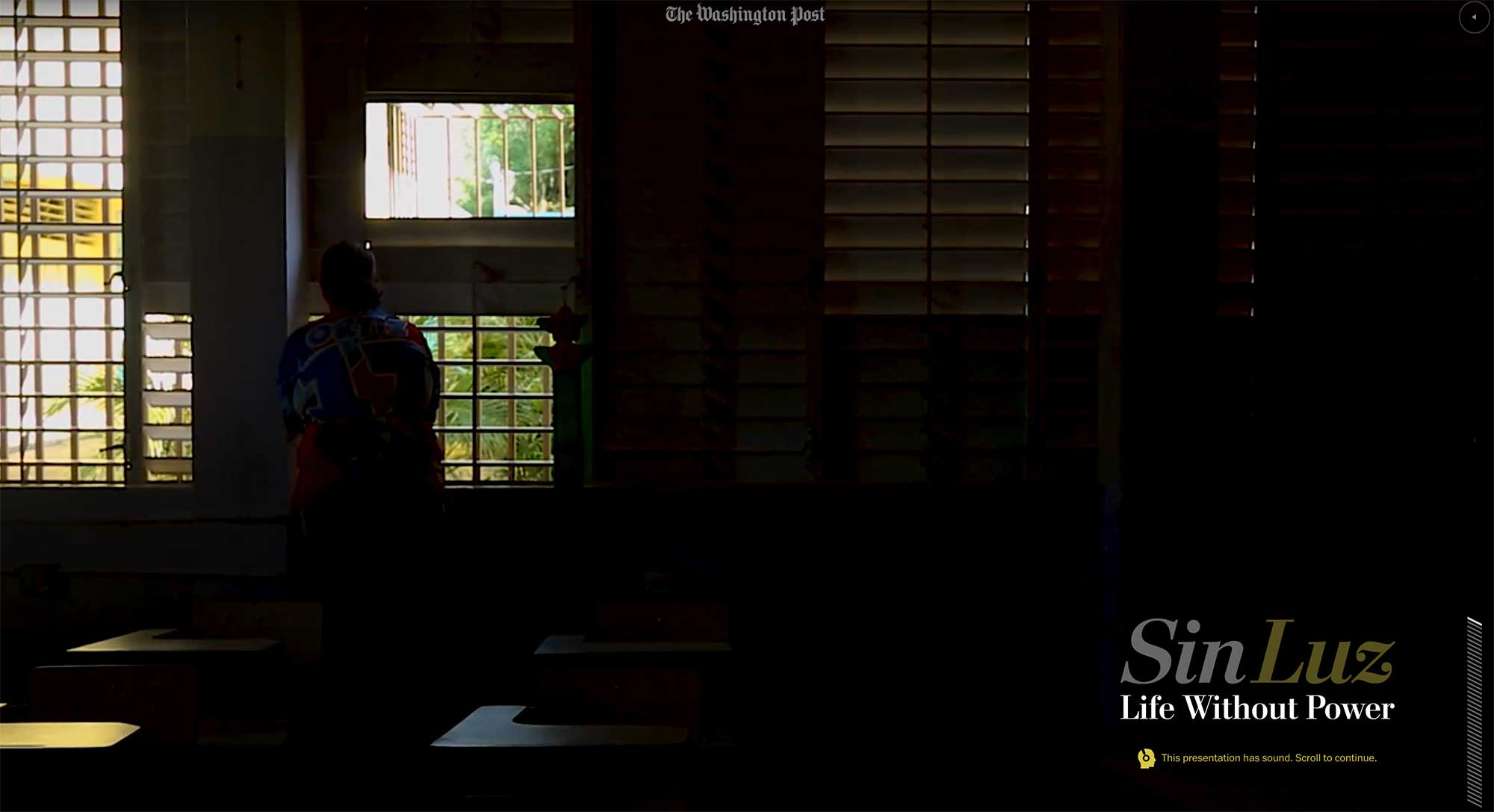
Sin Luz

Published in The Washington Post, December 2017


I was a lead editor and project manager on this story, which showed the difficulty of life without power after Hurricane Maria devastated Puerto Rico, and the resilience of the Puerto Rican people as they dealt with the challenges.

Sin Luz

In addition to smart user interface design and an incredibly powerful story, we created 3-D terrain maps of the island and used photogrammetry and drone footage to recreate the scene.
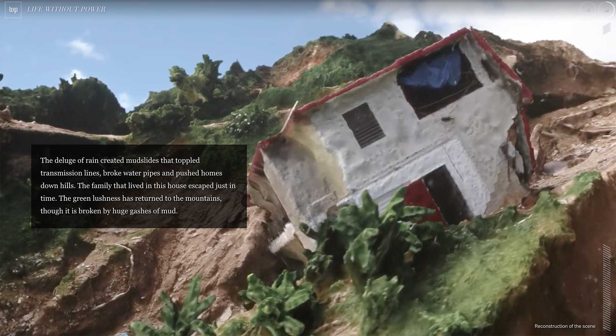
Role: Editing, project management

Awards: World Press Photo, Immersive Storytelling, second prize

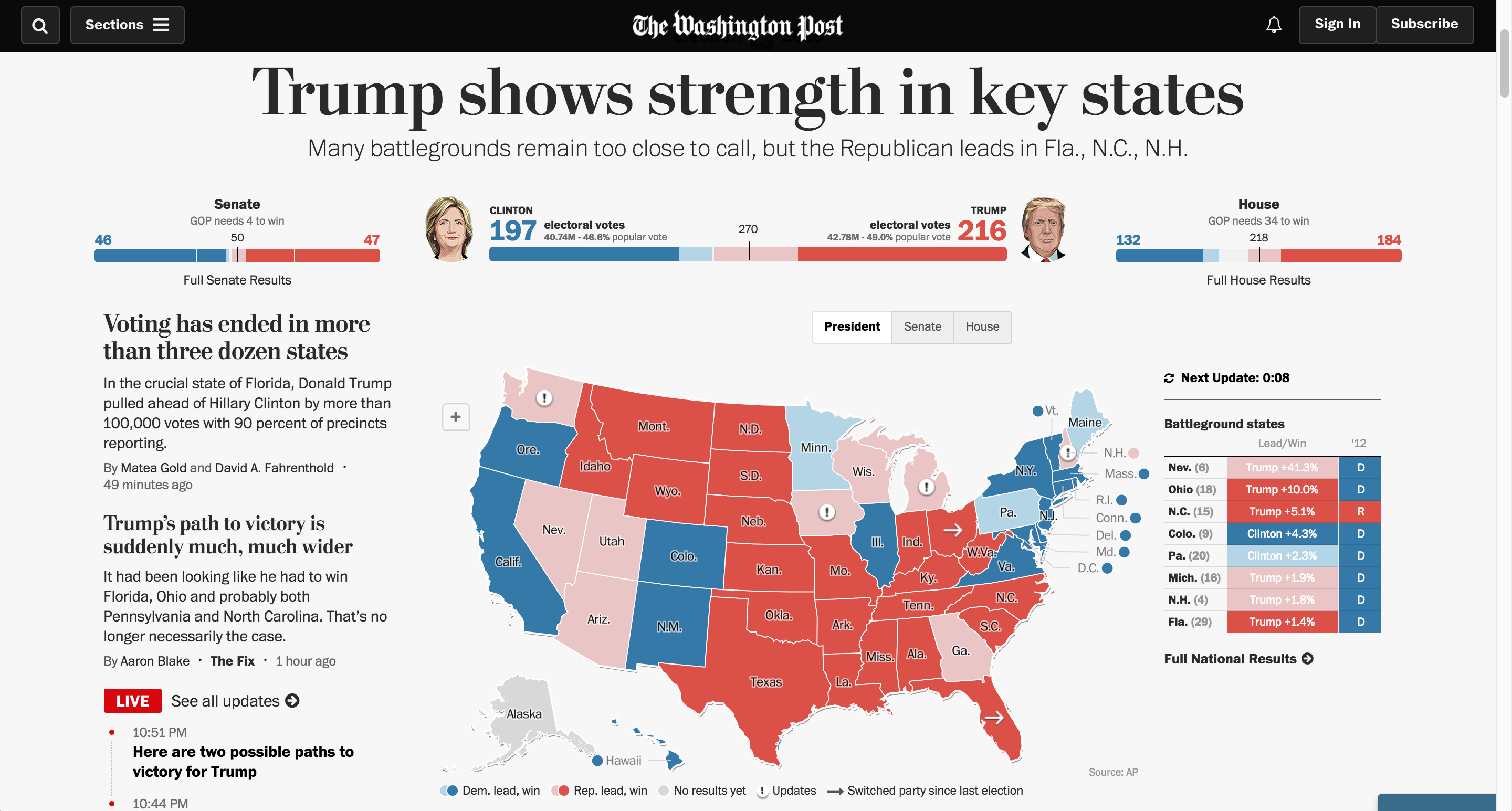
Live presentation for 2016 election

Published in The Washington Post, November 2016

US Election results 2016

I pitched, developed and managed a partnership with Development Seed to execute the engineering and presentation of results displays for the 2016 election cycle. I was the project lead, working across multiple departments internally and externally to manage contracts, understand and prioritize needs, develop strategy, test and improve the technology and brief stakeholders.

These maps ran across The Washington Post products, including our site and native applications on iOS and Android, and many of our news service client sites.

Role: Editing, project management

My team also created dozens of other fantastic graphics for the election, collected here.

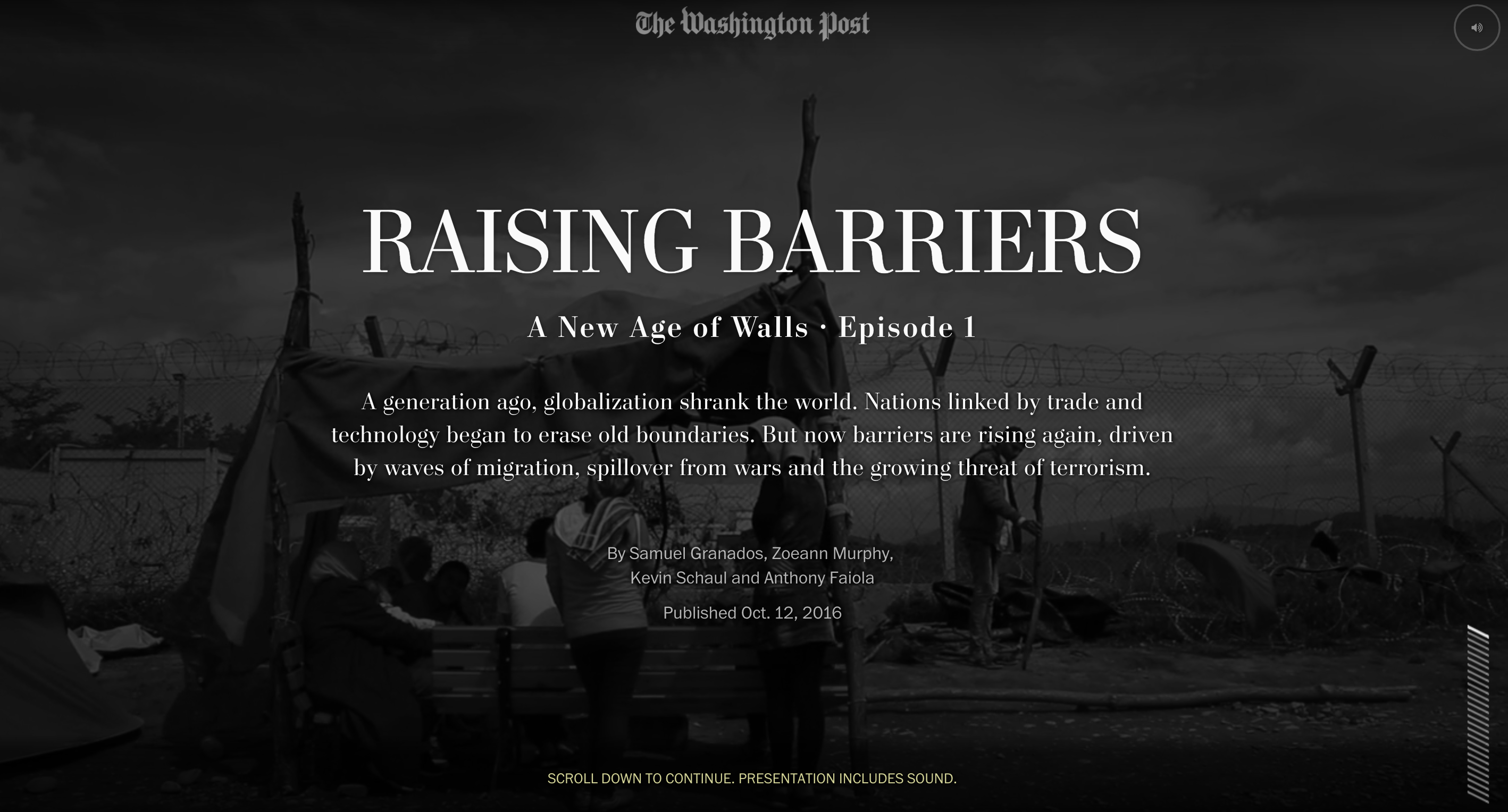
A New Age of Walls

Published in The Washington Post, October 2016

A New Age of Walls

I was the lead editor and project manager on this 3-part series, which explained the rise of barriers worldwide as a means of preventing migration and providing border security. It explored their effectiveness and impact in a deeply compelling narrative that melded text, video and graphics in ways we haven’t tried before. My team led the field reporting in collaboration with foreign correspondents, and I led the editing team, which also included a video editor and the foreign editor.

Role: Editing, project management, storyboarding, prototyping

Awards: Malofiej International Infographics Awards Human Rights Best Graphics Award and Gold medal in features category; Gold medal in the Society of News Design digital awards; Finalist for a Webby award; White House News Photographers Association, First place in Best Multimedia Package; First prize in Innovative Storytelling in World Press Photo’s 2017 Digital Storytelling Contest, Emmy nomination in Outstanding New Approaches: Documentary, and OJA finalist in Excellence and Innovation in Visual Digital Storytelling

In the news:
Washington Post series on border barriers aims to break the mould of digital storytelling (Journalism.co.uk)
If you dream big, you can redefine the way we tell stories in the digital age (The Washington Post on Medium)

America’s Great Housing Divide

Published in The Washington Post, April 2016

Housing

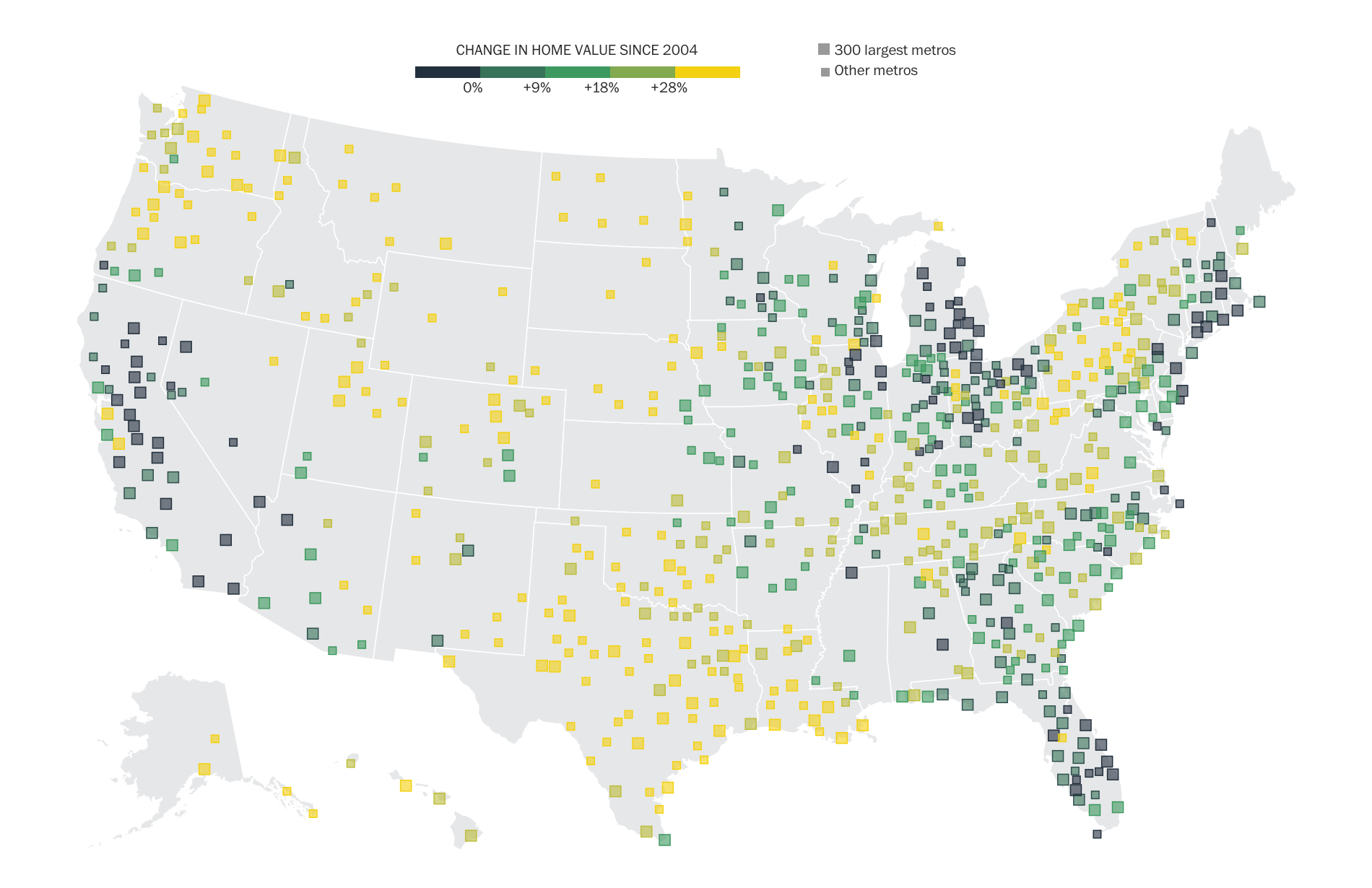
This series about the recovery of the U.S. housing market was instigated by Ted Mellnik, one of our best data reporters. Emily Badger from the Wonkblog came on board and Darla Cameron explored many kinds of visual approaches. Denise Lu took over for Darla when she went on maternity leave and Madia Brown worked on design of the stories that followed the overview.

screenshot-2016-10-06-06-38-01

For digital audiences, we created a geo-focused story with text customized to your zip code, featuring an interactive map of home value changes over the past decade. For print, we combined the Stockton, Calif., story together with the overview of findings that we had online.

Working with our newsletters editor, we created a very successful email campaign that sent emails to readers from the different cities we covered in the series. I love the clean design, simple and intuitive user interface, clear writing and navigation.

Role: Editing, project management, some design and development.

Awards: Finalist for an OJA for Explanatory Reporting; Finalist for Loeb Award, Explanatory Category

NICAR presentation on visualization

I just got back from the NICAR conference in St. Louis, where I gave a talk with Bill Keaggy on Best Visualization Practices. There’s delicious stack of links here: http://bit.ly/nicar2012 and the presentation is here (click the settings gear and open speaker notes to find out what we talked about):

Chrys Wu kept a detailed list of links if you want to check out some of the other sessions. I also got the see the St. Louis arch! Very exciting:

St. Louis Arch

View from the top: St. Louis Arch

New year, new post

It’s been a busy few months, but I’m gonna squeeze in a post for January! I’ve switched jobs at the Post and moved into a new role, Interactive Projects Editor, focusing on creating interactive projects that combine design and graphics with video, photography and social media. I’m really looking forward to the new challenge. In other news, I’m getting used to the new delicious and trying out this ‘stacks’ thing. I’ve got a few going, namely one on interactive maps and one for games and quizzes. I’ll keep those updated as I collect links around the web. And, some of my recent work….

Pinocchio tracker
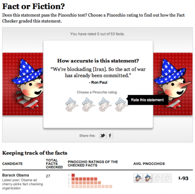
The tracker part of this was originally done with Tableau, but we decided to rework it and to add a game element to it. It’s on a page of its own as well as in the right rail on all our politics content. Try it out!

The Media Divide
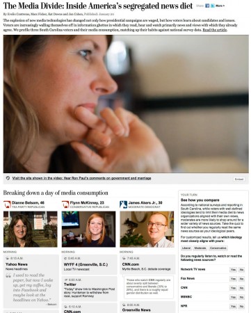
This piece was born from a project by Marc Fisher to track what media people consume in a day and see how it reflects their ideology. Evelio Contreras did this great video and we put it together in a calendar with links to all the news they watched/read/listened to, and combined that with a poll.

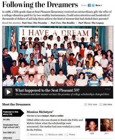
The Seat Pleasant 59
This project leads with Whitney Shefte’s awesome video about a class of students who were promised that if they graduated from high school, their college would be paid for. We tracked down the students and found out where they are now. My contribution was the list/grid view and filtering along with itemizing content for each of the dreamers.

Recent projects: Remembering the decade and new timeline template

It’s been a little while since I updated the blog, so here are a couple of projects from the past month and a half that I think are pretty cool.

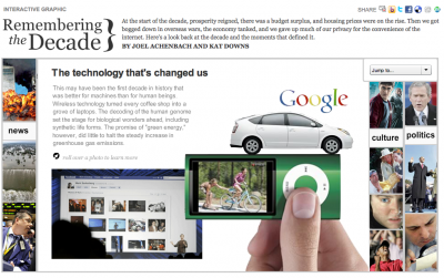
The first is a look back at the aughts that I worked on with Joel Achenbach, which was great because I’ve always admired his work and thought he was hilarious. I designed and build a fairly simple panel graphic that has collages of some major things that happened in the 2000s and will impact our memory of the decade. I think it ended up looking pretty cool and it was a fun look back…

Remembering the decade (washingtonpost.com)

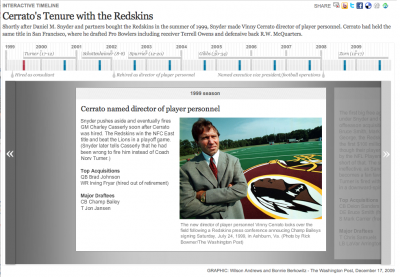
At the end of December I spent a few days working on a new timeline template for washingtonpost.com. I created a new template that improved upon the navigation of our old timeline and allowed more flexibility in text and photo sizing, as well as automatic point placement and the use of points in time and ranges of time.

Cerrato Timeline (washingtonpost.com)

We’ve already used the template for several timelines, including the Cerrato timeline above, a look at women in political history, surge strategy timeline, and a look at Virginia inauguration history.

Nationwide County Map

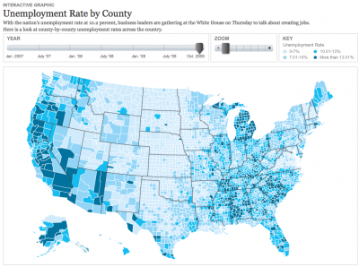
After many months talking about how we wanted to produce a nationwide county map, we finally had a project come up that called for one with a quick turnaroud — one and a half days! With a great base map by Nathaniel Vaughn Kelso, I created this United States county map that shows unemployment from 2007-2009. This is an early version, so there’s a lot of improvements to make, but I think it’s a solid start, and I’m happy we turned it around as fast as we did. I used classes I created for the helicopters state map and the Virginia governor’s race map to make the build much easier.

Unemployment by county

D.C.’s unemployment rate was 12.1% in Oct. 2009 — really high. Macon County, where Franklin is, had an unemployment rate of 10.3%. We’ll keep adding to this map as time goes on, and I think it’ll be really interesting to see what happens with jobs and the economy over time.