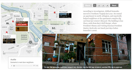
Last week, after the news broke that one of the 10 alleged Russian spies arrested by the FBI most recently lived and worked in Arlington, Va., Ben de la Cruz came up with the idea to do some panos of the scenes where the alleged spy lived his life. We talked through how we’d like to present it and how the story would flow through the audio and panos. Then Ben worked with Alex Garcia to shoot and stitch the panos and he wrote and recorded the narration. I put together the piece in a slideshow format, with audio and a pano for each location on the map. It took about 6 hours of my time to put together. It’s a nice little piece that’s a window into the life of a spy — something we’re all very curious about.
Metro Fare Calculator
A few weeks ago I put together this little fare calculator that helps people figure out how much their rates are going up since the new fares have passed. It’s a really simple but useful tool.
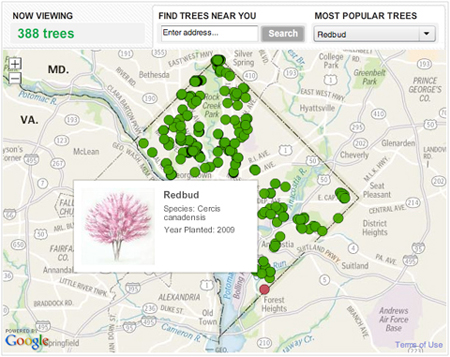
Arbor Day Trees Map
We published this graphic for Arbor Day, which was on April 30. It takes a look at all the trees that have been planted by the non-profit organization Casey Trees since 2003. They’ve planted thousands of trees in order to try to increase D.C.’s “urban canopy.” You can use this tool to see where they’ve planted trees in your neighborhood and what kind they are.
From a technical standpoint, this project was really interesting. It was executed in about two days, so it was a really quick turnaround, considering I haven’t done extensive development with the google maps api. Nathaniel and Gene worked up some cool custom tiles, and I designed and programmed a lot of it, and fit all the pieces together. Keep reading this post ยป
2010 Political Race Maps: House, Senate and Governors
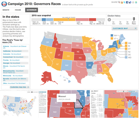
These three new race maps (house, senate, and governors) launched today with the new PostPolitics section of The Washington Post. I worked with Karen Yourish and Dan Keating, who are absolutely amazing data whizzes, to get the data together for the project, and Nathaniel Vaughn Kelso gave me some great base maps to start with. We really wanted to give a complete picture of the 2010 races, so we have current race ratings (for house, we have state of the race), election history for each district or state, and demographic information that lets you see some cool patterns — like how states vote when they have a high percentage of seniors or high poverty rates. Keep reading this post »
D.C.’s rock scene: 9:30 club turns 30
I spent the last few days working on this piece about the 30th anniversary of the opening of the 9:30 club, one of the best venues in D.C. (and a lot of people would say the whole country). Alex Garcia shot some great concert video and interviewed some key people, and Josh du Lac wrote the magazine story. I pulled it all together in this multimedia slideshow, which has several different text layouts and video in varying sizes. The content of this is the coolest part — there are some great stories in there about the old club: how there were so many rats they had something called the “rat highway,” how Will Smith (The Fresh Prince) showed up and just left without playing the show because he was so disgusted at how the place looked and smelled, and a whole bunch more. There are also some great photos from the ’80s and ’90s. I pulled the illustrations from the magazine layout, which you can see here.
Peeps contest finalists
Akira Hakuta created these videos about the five finalists in The Washington Post’s Peeps Diorama contest, which has some really creative entries this year. Videos feature The Mad Hatter, Korean War memorial, the movie Up, and “Goodnight Peeps.” I created the player, which is almost exactly the same as the Scene In player. Noel Smart designed the logo treatment.
New county map: Ultra-high Medicare Billing Rates
I re-purposed the unemployment map for this story about ultra-high billing rates at skilled nursing facilities in the U.S. It shows where facilities are billing ultra-high rates. The Washington Post found that nursing homes have flooded ‘ultra-high’ billing categories with patients, and the amount of waste and abuse could reach billions of dollars a year. Check out the graphic or read the story by Scott Higham and Dan Keating.
New project: Graphic explains the search for a serial rapist
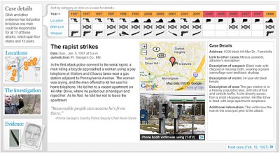
I worked on this graphic with reporters Josh White and Maria Glod, who collected an incredible amount of information on the East Coast Rapist, a man who has been on the loose for 13 years and is a suspect in 17 cases. For this important story, I organized the data that Josh and Maria collected into an easy-to-use interface that had the details of each case, including a small photo gallery, a google map, a quote and all the case information. I built an interface that drew connections between the cases and allowed people to sort the cases by date, location, existence of dna samples, and the weapon used. It also featured a map interface, a gallery and a video. Keep reading this post »
Videos from India Trip
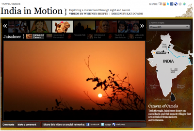
A full year after Whitney and my trip to India, we finally finished up the piece we were working on for it: India in Motion, which was published on The Washington Post’s website. Whitney did over 20 short videos reflecting the sights and sounds of the country.
There are videos from almost all the places we visited, chief among them Mumbai, Udaipur and Rishikesh. I designed the piece and built the player, which had some similarities to Scene In in that it was a series player and I used some of the same code, but look and feel wise, it is pretty different. Keep reading this post »
Recent projects: Remembering the decade and new timeline template
It’s been a little while since I updated the blog, so here are a couple of projects from the past month and a half that I think are pretty cool.
The first is a look back at the aughts that I worked on with Joel Achenbach, which was great because I’ve always admired his work and thought he was hilarious. I designed and build a fairly simple panel graphic that has collages of some major things that happened in the 2000s and will impact our memory of the decade. I think it ended up looking pretty cool and it was a fun look back…
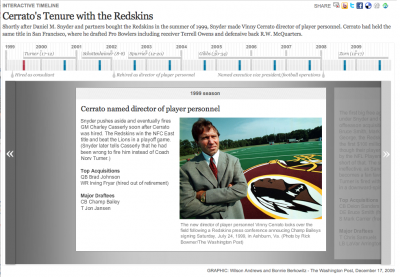
At the end of December I spent a few days working on a new timeline template for washingtonpost.com. I created a new template that improved upon the navigation of our old timeline and allowed more flexibility in text and photo sizing, as well as automatic point placement and the use of points in time and ranges of time.
We’ve already used the template for several timelines, including the Cerrato timeline above, a look at women in political history, surge strategy timeline, and a look at Virginia inauguration history.