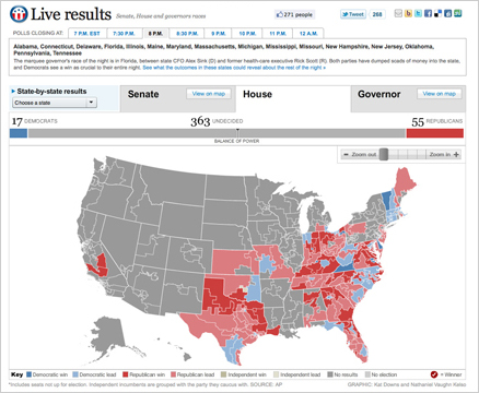
On Nov. 2, midterm election day, we put up these maps that tracked the results as they came in. For Senate and Governors we had state and county-level data, and we had House districts as well. This suite of maps was published in The Washington Post, as well as on Yahoo! News and the Telegraph (UK). The maps have balance of power charting and tabular results as well as zooming and deep linking features. Read more about how we built the maps »
![[Map image]](http://2.bp.blogspot.com/_1NI9wgirUFw/SucwgpHmSpI/AAAAAAAAAIs/lQwnCpmThN4/s400/Picture+1.png)