Just launched this beautiful presentation today. Wilson Andrews and Tim Wong led from the design side. Love the responsive template and the clean and elegant feel.
Washington Post Olympics graphics and multimedia roundup
Here’s some of what the WaPo team put together for the London Olympics:
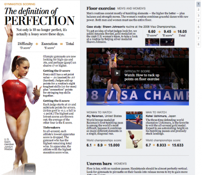
The definition of perfection
I designed this piece about how gymnastics scoring worked. Wilson Andrews developed it and edited/animated the videos, and Bonnie Berkowitz did the writing.
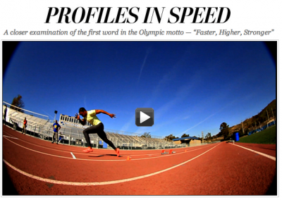
Profiles in Speed
This six-part series we developed in the run-up to the Olympics featured greats like Missy Franklin, Michael Phelps and Carmelita Jeter. Videos, infographics, and awesome articles. I especially love the segment on technology.
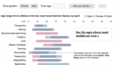
Are you over the hill for Olympic sports?
As part of the Profiles in Speed series, I developed this graphic which lets you see where you fit into the Olympic age spectrum. Flowing Data wrote about it here.
Royal rumors (and some graphics fun)
With Kate and Will back in the news for the rumors about a pregnancy with twins (not true, by the way), I thought, “Hey, what better opportunity to make up for the fact that I never wrote about our royal wedding graphics on the blog?” So here I am. Royal couple junkies, enjoy. And if you’re a true royal wedding fanatic, you might enjoy this video about my roommate, coincidentally also named Kate Middleton (this one is true).
The main piece I worked on was the Westminster Abbey and parade route tour. Sohail Al-Jamea and Alberto Cuadra worked together on the 3-D renderings and animations, and I layered on the interactivity and created the Google Earth flyovers and, with help from Laris Karklis, the parade route maps and Street View layers.
Games: Testing your memory
I worked on these games last Monday for publication with Tuesday’s health section. Reporter Leslie Tamura collected a whole bunch of tests that indicate how you’re aging compared to peers. We decided to take some of those tests and replicate them for our online readers. We decided on word recall, face recognition and response time. Simple, but fun. Check them out!
Creating Live Election Results Maps
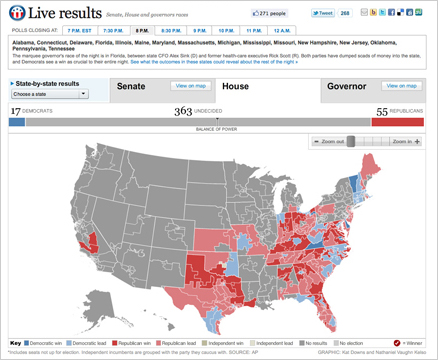
On Nov. 2, midterm election day, we put up these maps that tracked the results as they came in. For Senate and Governors we had state and county-level data, and we had House districts as well. This suite of maps was published in The Washington Post, as well as on Yahoo! News and the Telegraph (UK). The maps have balance of power charting and tabular results as well as zooming and deep linking features. Read more about how we built the maps »

