Just launched this beautiful presentation today. Wilson Andrews and Tim Wong led from the design side. Love the responsive template and the clean and elegant feel.
The power of the crowd: Is life getting better or worse?
An excerpt of my post about our new project on the WP innovations blog:
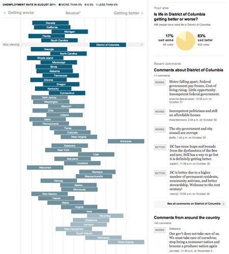
This is one of the first projects to take users opinions and mash them up with actual data to see whether perceptions match up with reality. It’s a fascinating window into how people feel about the places where they live and a forum for a conversation around how things are changing.
There are already some patterns emerging. We are starting to see that, in general, more states with high unemployment are being rated ‘worse’ by users, and more places with low unemployment are being rated ‘better’.
D.C. stands out – though unemployment is high, 83 percent of users (as of publication of this post) ranked it better. One left a comment after rating it ‘better’: “DC is better due to a higher number of permanent residents, community activism, and better stewardship. Welcome to the 21st century!” The comments on why people voted the way they did have been some of the most interesting results of the project we’ve seen so far.
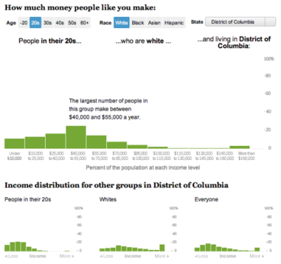
How does your income compare?
In an extremely quick turnaround, I worked with Dan Keating to create this tool that shows you the breakdown of what other people of your age, race, and location make each year. Hopefully in the future we’ll be able to improve it and add some more metrics, but it’s pretty cool for taking less than a day!
Analyzing the U.S. tax code, break by break, and other recent charts
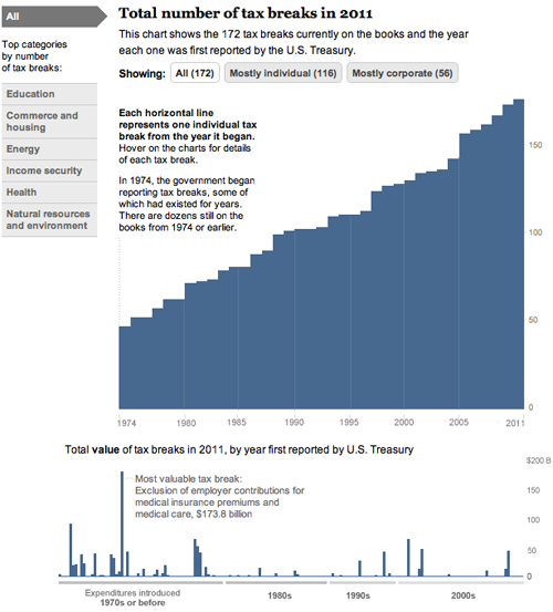
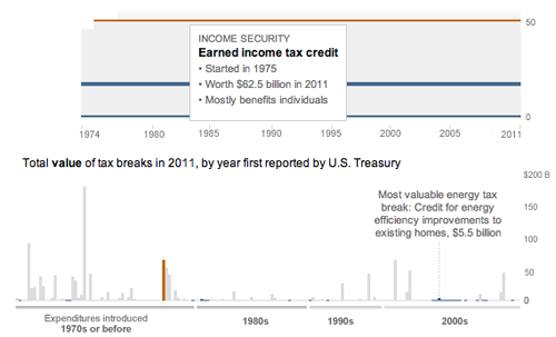
Today, we came out with a new graphic that looks at the tax breaks on the books this year. It is part of Running in the Red, a series the Post has been running for the past few months, and accompanied Lori Montgomery’s front-page story, “Ever-increasing tax breaks for U.S. families eclipse benefits for special interests,” a great story that explains spending through the tax code.
The graphic is all CSS and JavaScript. With charts that only have bars, it’s simple to dynamically add sized divs with background colors that create charts. The data will update automatically if necessary and it works across all browsers and mobile platforms with no workarounds:
And has details for each of the 172 breaks currently active (see below). Added bonus: I learned a ton about the tax code.
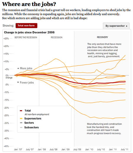
And a couple more (relatively) recent charts:
This one I worked on with Alicia Parlapiano and Neil Irwin. Because I wanted to create animate transitions and interactivity, I used Flash to create this graphic. It has detailed drilldowns to look at employment in each sector of the economy. I tried to inject more annotation into this graphic (and the taxes one above) than we have done in the past with data-driven graphics. Instead of throwing a bunch of data out there, we’re providing more context and guided views — by category and by sector versus a completely self-guided data dive.
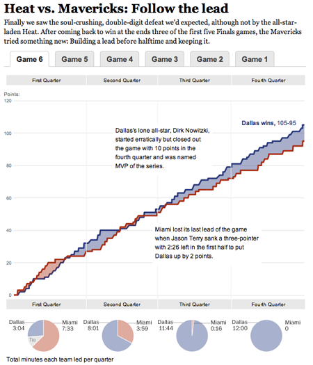
This was a fun chart I helped our intern, Heather Billings, with at the beginning of the summer. We used flot to make these charts showing how the lead changed between the Heat and the Mavericks during the NBA finals. This was particularly fun for me because I got really into the NBA finals this year and watched every game. I know, hard to believe, but true. I was a having a great time analyzing the outcome of the games and reading all the news — and if you missed it, this was a great article from Bill Simmons at Grantland.
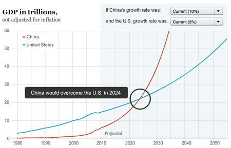
And another one about when and if China’s economy will pass the United States to become the world’s largest.
Recap from Malofiej 19

In March, I set out for Pamplona, Spain, to join the jury of Malofiej 19. For three days, we judged hundreds of entries in the digital contest, while colleagues on the print side saw over 1,000 entries. Check out the awards here.
Other jury members came from all over the world — Germany, Argentina, Chile, Spain, Italy, and the United States. I met a ton of awesome people who share a passion for infographics and alternative forms of storytelling. Gert Nielson keeps a good log of the goings on at his blog, Visual Journalism. Kaitlin Yarnall of National Geographic wrote a summary piece for the Society of News Design blog here. Javier Errea, who organizes the event, also wrote a post on his blog (in Spanish).
I really liked Stephen Few’s presentation on Infographics and the Brain — reminding us all to think not only of how we want to present the information, but how it will be perceived. It doesn’t matter how good it looks or how clever we think it is if it misses the basic point: helping people understand information.
I gave my presentation on the power of using social media and user-generated content in graphics. I focused on two types of input — that which comes directly from our users (games, polls, submissions) and that which comes from existing social networks (facebook, twitter, foursquare, flickr). The amount of information out there is incredible, and we have to figure out how to use it in ways that show how people fit into their world. The opportunities are endless. Recently some interesting projects have come out that harness some of that power, including the Wall Street Journal’s Foursquare project, a look at check-ins over a week’s time in New York and San Francisco, and the New York Times Bin Laden emotion grid.
For more photos from Malofiej, go here.
Games: Testing your memory
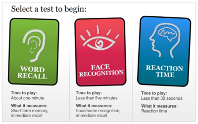
I worked on these games last Monday for publication with Tuesday’s health section. Reporter Leslie Tamura collected a whole bunch of tests that indicate how you’re aging compared to peers. We decided to take some of those tests and replicate them for our online readers. We decided on word recall, face recognition and response time. Simple, but fun. Check them out!
