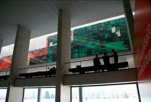
In March, I set out for Pamplona, Spain, to join the jury of Malofiej 19. For three days, we judged hundreds of entries in the digital contest, while colleagues on the print side saw over 1,000 entries. Check out the awards here.
Other jury members came from all over the world — Germany, Argentina, Chile, Spain, Italy, and the United States. I met a ton of awesome people who share a passion for infographics and alternative forms of storytelling. Gert Nielson keeps a good log of the goings on at his blog, Visual Journalism. Kaitlin Yarnall of National Geographic wrote a summary piece for the Society of News Design blog here. Javier Errea, who organizes the event, also wrote a post on his blog (in Spanish).
I really liked Stephen Few’s presentation on Infographics and the Brain — reminding us all to think not only of how we want to present the information, but how it will be perceived. It doesn’t matter how good it looks or how clever we think it is if it misses the basic point: helping people understand information.
I gave my presentation on the power of using social media and user-generated content in graphics. I focused on two types of input — that which comes directly from our users (games, polls, submissions) and that which comes from existing social networks (facebook, twitter, foursquare, flickr). The amount of information out there is incredible, and we have to figure out how to use it in ways that show how people fit into their world. The opportunities are endless. Recently some interesting projects have come out that harness some of that power, including the Wall Street Journal’s Foursquare project, a look at check-ins over a week’s time in New York and San Francisco, and the New York Times Bin Laden emotion grid.
For more photos from Malofiej, go here.