Mapping the news: Libya and Japan

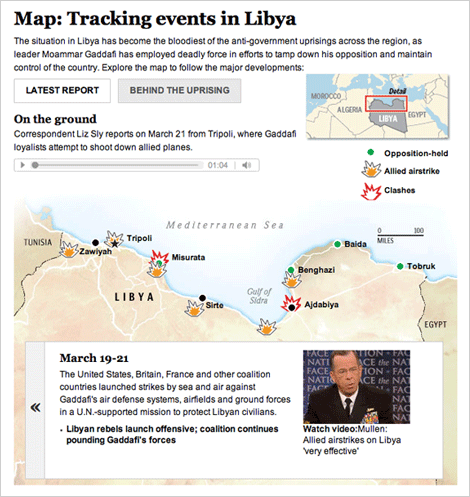
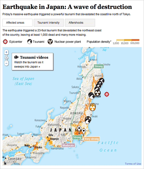
The past several weeks have been full of foreign news, and we have been producing lots of graphics to explain what’s happening. I have worked on these two graphics, one about the earthquake and subsequent tsunami in Japan, and one that explains what is going on in Libya.

For a full explanation of the process of creating the Japan graphic, visit the new Innovations blog at the WP (excerpted below):

Friday morning, as news of the earthquake in Japan spread, we started pulling together an interactive map that would show readers where and how events unfolded. Over the next 36 hours, we would continually expand and improve the information, design and interactivity of the map as the news of the earthquake and tsunami came in. Read more »

For Libya, we combined an event tracker with audio and video from the ground. The reports from correspondents on the ground is my favorite part.

Both graphics are done using javascript and jquery, so check them out on your tablet devices!
Liquor sales and consumption

Liquor sales

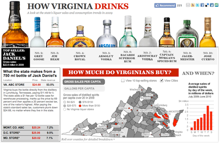
This piece on liquor sales and consumption in Virginia features the 10 top-selling liquors in the state, as well as a tax breakdown and a map showing which areas are purchasing the most liquor. I think looking at the top sellers is interesting — to see that Aristocrat sold more than Jose Cuervo or Captain Morgan. It was a quick-turnaround, fun piece that paints a picture of how Virginia drinks.

Arbor Day Trees Map

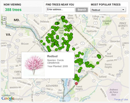
We published this graphic for Arbor Day, which was on April 30. It takes a look at all the trees that have been planted by the non-profit organization Casey Trees since 2003. They’ve planted thousands of trees in order to try to increase D.C.’s “urban canopy.” You can use this tool to see where they’ve planted trees in your neighborhood and what kind they are.

Redbud Trees in DC

From a technical standpoint, this project was really interesting. It was executed in about two days, so it was a really quick turnaround, considering I haven’t done extensive development with the google maps api. Nathaniel and Gene worked up some cool custom tiles, and I designed and programmed a lot of it, and fit all the pieces together. Keep reading this post ยป

Map of DC AIDS Providers for Wasting Away series

This morning a project went up that I’ve been working on for a while. Debbie Cenziper investigated this really interesting piece on funding for AIDS providers in D.C.

“In a city ravaged by the highest rate of AIDS cases in the nation, the D.C. Health Department paid millions to nonprofit groups that delivered substandard services or failed to account for any work at all, even as sick people searched for care or died waiting.” – Staggering need, striking neglect

Whitney Shefte also did this beautiful documentary piece on AIDS in DC, which is really touching and a great overview of what’s happening in the city. For the package, I designed the splash page, the chapterized video player for Whitney’s documentary, and a map of providers in the district.

[Map of AIDS Providers in D.C.
Map of D.C. Aids Providers

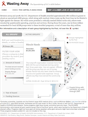
Mary Kate Cannistra located the agencies and provided me with a base map, and I built this piece that allows sorting through a slider mechanism and with radio button components. You can isolate agencies based on amount of funding, year of award or type of funding. It allows you to get more information by rolling over agencies or by selecting from a dropdown list, which is updated whenever you change the filters. We’ve also highlighted six providers, for which we’ve added extra information (photo and paragraph description).

The slider is reusable, you just initialize it with the two amounts at either end and the data that needs to update. I think we’ll have a lot of use for that functionality moving forward.