Just launched this beautiful presentation today. Wilson Andrews and Tim Wong led from the design side. Love the responsive template and the clean and elegant feel.
Washington Post Olympics graphics and multimedia roundup
Here’s some of what the WaPo team put together for the London Olympics:
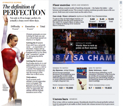
The definition of perfection
I designed this piece about how gymnastics scoring worked. Wilson Andrews developed it and edited/animated the videos, and Bonnie Berkowitz did the writing.
Profiles in Speed
This six-part series we developed in the run-up to the Olympics featured greats like Missy Franklin, Michael Phelps and Carmelita Jeter. Videos, infographics, and awesome articles. I especially love the segment on technology.
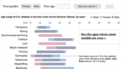
Are you over the hill for Olympic sports?
As part of the Profiles in Speed series, I developed this graphic which lets you see where you fit into the Olympic age spectrum. Flowing Data wrote about it here.
Analyzing the U.S. tax code, break by break, and other recent charts
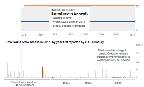
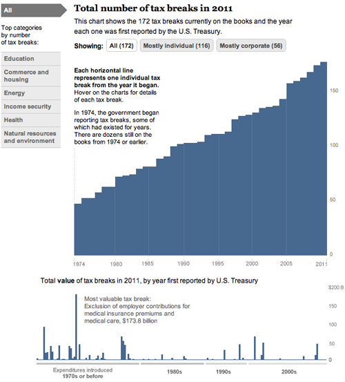
Today, we came out with a new graphic that looks at the tax breaks on the books this year. It is part of Running in the Red, a series the Post has been running for the past few months, and accompanied Lori Montgomery’s front-page story, “Ever-increasing tax breaks for U.S. families eclipse benefits for special interests,” a great story that explains spending through the tax code.
The graphic is all CSS and JavaScript. With charts that only have bars, it’s simple to dynamically add sized divs with background colors that create charts. The data will update automatically if necessary and it works across all browsers and mobile platforms with no workarounds:
And has details for each of the 172 breaks currently active (see below). Added bonus: I learned a ton about the tax code.
And a couple more (relatively) recent charts:
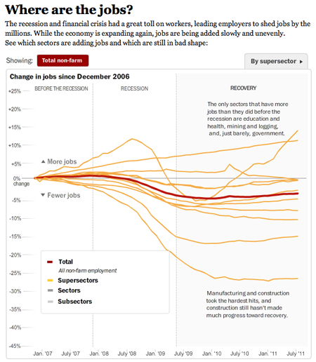
This one I worked on with Alicia Parlapiano and Neil Irwin. Because I wanted to create animate transitions and interactivity, I used Flash to create this graphic. It has detailed drilldowns to look at employment in each sector of the economy. I tried to inject more annotation into this graphic (and the taxes one above) than we have done in the past with data-driven graphics. Instead of throwing a bunch of data out there, we’re providing more context and guided views — by category and by sector versus a completely self-guided data dive.
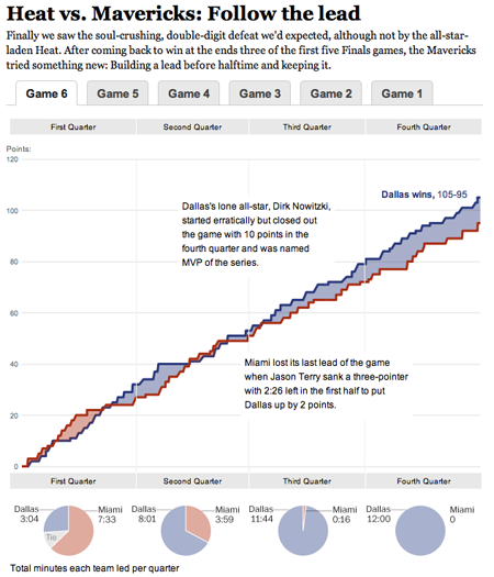
This was a fun chart I helped our intern, Heather Billings, with at the beginning of the summer. We used flot to make these charts showing how the lead changed between the Heat and the Mavericks during the NBA finals. This was particularly fun for me because I got really into the NBA finals this year and watched every game. I know, hard to believe, but true. I was a having a great time analyzing the outcome of the games and reading all the news — and if you missed it, this was a great article from Bill Simmons at Grantland.
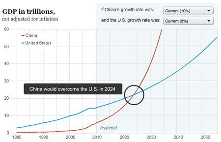
And another one about when and if China’s economy will pass the United States to become the world’s largest.
New Graphic: Redskins Lawsuits, Tickets
This graphic was published today, accompanying a story by James Grimaldi about how the Redskins are selling their tickets to brokers. The graphic explores lawsuits filed by the Redskins since 2005 and tickets sold to one broker in 2008. It also shows which tickets they filed lawsuits over and then resold to the broker. The lawsuits are sortable by amount and status, and the tickets are sortable by game.


![[Redskins graphic]](http://3.bp.blogspot.com/_1NI9wgirUFw/Sp83a72OmZI/AAAAAAAAAGQ/gwKjRo2pvaM/s400/Picture+7.png)