
Design, programming assistance
Homicides map
As I designed this app, I was thinking about how to allow people to quickly find homicides in their area. That led to a decision to focus on neighborhoods. We let people see groupings of crimes that are meaningful to them in both the map and corresponding charts. To surface trends at a city-wide level, we added four promo spots above the map that send people directly to important stories in the app. And a timelapse feature lets people view trends, year by year, across the city and in specific neighborhoods. We’re getting great feedback from users; many people are telling us that they found surprising and intriguing information in the app.
More JavaScript maps: 2010 census, Republican primary tracker, Earthquake in Japan
We just launched this interactive map with details about 2,294 homicides that occurred in D.C. between 2000 and 2011. You can find the killings in your neighborhood, follow the trends over time, and learn how the victims died and what happened to their cases.
Key findings featured in the graphic:
Click the headline to jump straight to that view in the map.
Homicides in D.C. are down 55 percent since 2000
The number of homicides in the District fell last year to 108, a 49-year low. Despite the decline, homicide continues to be a tough crime to solve and prosecute in the city.
30 percent of homicides in D.C. led to convictions for murder or manslaughter
Of the 2,294 homicides that occurred in the District of Columbia between 2000 and 2011, 694 led to convictions for murder or manslaughter. At least 189 cases ended with administrative closures.
Motives: Drug killings down 84 percent
The most common motives for homicide in D.C. are arguments, drugs and retaliation. About 2 percent are classified as gang-related. Homicides involving drugs have decreased about 84 percent since 2000. Drug-related homicides accounted for eight of the city’s killings last year, compared with 49 in 2000.
Most dangerous age: 24 percent of those killed were in their early 20s
More than half of the District’s homicide victims between 2000 and 2011 were between the ages of 15 and 29. About 93 percent of those victims were male, and 94 percent were African American.
Tags:
andrew metcalf,
dc,
Design and infographics,
google maps,
graphics,
investigations,
Maps,
serdar tumgoren,
washingtonpost.com,
Work
New version of Say What for debates went live yesterday:
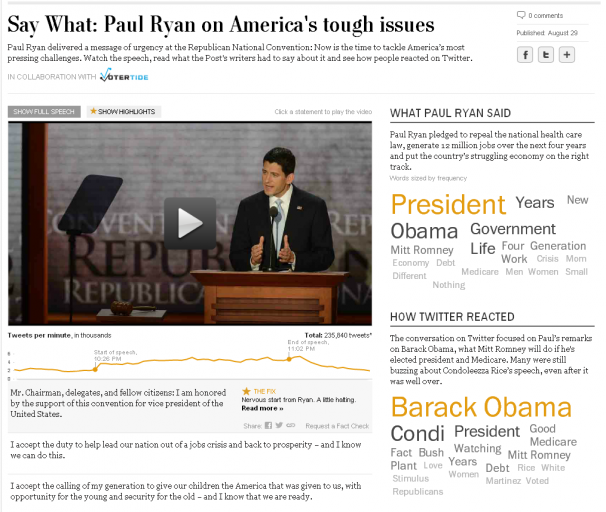
Yesterday, we launched a new project: an interactive transcript player that matches up the words of the speech, Post analysis, and reaction from Twitter.
I have been wanting to do a Twitter project for a while, and this time all the pieces fit together. After I pitched the idea, Cory Haik coordinated a partnership with VoterTide, a great company in Omaha that does aggregation and analysis of Twitter trends specifically around politics, that made the Twitter analysis segment possible. I designed the piece, and we were able to get two awesome developers, Leslie Passante and Jeremy Bowers, to build it.
My favorite things are the ‘watch highlights’ view, where you can see all the Post analysis and skip everything else, and the addition of the social layer. Here’s an excerpt from the ‘Ask the Post’ blog post we put together on it:
… VoterTide will provide user reactions as they happen on Twitter, and we’ll match that to the moment in time these reactions occurred during the speech. We will package these reactions to reveal insights into the nation’s response to the conventions and their most-watched speeches.
We’ve gotten some great reaction from this project on washingtonpost.com and on Twitter. It was also written up by Poynter:
So as the GOP nominee took to the podium and the president prepares to do the same at next week’s DNC, it is appropriate that journalists roll out the coolest newest thing. The Washington Post did just that.
“Some innovations we have done, you step back and say, ‘That was fun.’ And some you might say, ‘We produced a new story form.’ But this time I think we can say both,” Haik said.
Totally agree! And we just did another one for Mitt Romney’s speech. This project would not be possible without the awesome producers who put it together: Haley Crum and Mary Keister. Check it out!
Tags:
coryhaik,
Design and infographics,
development,
haley crum,
interactive,
jeremy bowers,
leslie passante,
mary keister,
projects,
social,
The Washington Post,
video,
washingtonpost.com,
Work
An excerpt of my post about our new project on the WP innovations blog:
This is one of the first projects to take users opinions and mash them up with actual data to see whether perceptions match up with reality. It’s a fascinating window into how people feel about the places where they live and a forum for a conversation around how things are changing.
There are already some patterns emerging. We are starting to see that, in general, more states with high unemployment are being rated ‘worse’ by users, and more places with low unemployment are being rated ‘better’.
D.C. stands out – though unemployment is high, 83 percent of users (as of publication of this post) ranked it better. One left a comment after rating it ‘better’: “DC is better due to a higher number of permanent residents, community activism, and better stewardship. Welcome to the 21st century!” The comments on why people voted the way they did have been some of the most interesting results of the project we’ve seen so far.
Read more of this post at @innovations »
Tags:
census,
dankeating,
Design and infographics,
infographics,
ugc,
unemployment,
usergeneratedgraphics,
washingtonpost.com,
Work
In an extremely quick turnaround, I worked with Dan Keating to create this tool that shows you the breakdown of what other people of your age, race, and location make each year. Hopefully in the future we’ll be able to improve it and add some more metrics, but it’s pretty cool for taking less than a day!
Tags:
acs,
census,
charts,
Dan Keating,
data,
income,
infographics,
The Washington Post

Design, programming, production
Coming home a
different person
I worked closely with Whitney Shefte and Alberto Cuadra to create this piece. We storyboarded the intro video, motion graphics segments, and the flow of the piece together, then each created the individual parts. I built the interactivity around the intro page menu, the brain segment, and the package navigation. It features deep linking to each video, gallery, or multimedia segment.

Design, programming
Better/Worse life project
I worked with Dan Keating (database) on this project, which takes a unique approach to user-generated data. It mashes up responses from users with actual numbers on unemployment, median income and population growth to see how people’s perceptions line up with reality. A week after launch we had nearly 5,000 responses. We use IP location to target the experience to the user’s county and state, and ask them to make a rating and, optionally, give us some demographic information and leave a comment. Read more here.
More user-centered projects: Are you over the hill for Olympic sports?, How does your income compare?

Design, programming
2010 Election Maps
I created these three race maps (house, senate, and governors) to correlate with the redesign of PostPolitics. I also created a live results map for election night. We really wanted to give a complete picture of the 2010 races, so we have current race ratings (except for the House, where we have state of the race), election history, and demographics that let you see some cool patterns — like how states vote when they have a high percentage of seniors or high poverty rates. Favorite features: really cool zoom functionality, which I explain in my blog, and a slider that shows historical results.
More Flash maps: Unemployment by County (read my blog post), A closer look at AIDS groups, Life expectancy across the U.S.

Design, programming
Memories of MLK
I heard that Nikki Kahn and Megan Rossman had been out shooting interviews with civil rights leaders in advance of the unveiling of the Martin Luther King Jr. memorial in D.C., and I approached them with the idea of doing a presentation that combined photography and videos and used the memories of those interviewed to tell the story of King’s life. I organized the memories so that they flowed through stages of King’s life and built up to the building of the memorial. I wanted to let the beautiful photos and powerful video quotes shine, so I went with a simple, clean interface that used strong pull quotes to draw people into the story. I really like the elegant navigation and the ability to share each story.
Related: Interactive memorial with Photosynth

Design, programming
I voted because…
This user-centered project launched on election day 2012. We asked people why they voted, created a customized button for them, then added that button into visualizations based on candidate, geography and topic. I developed the concept for the piece, designed the desktop and mobile applications, and built the mobile application — check it out on your phone! We got over 35,000 submissions.

Design, programming, reporting, audio
Rescue and recovery
This is a really powerful piece looking at Virginia Tech five years after the massacre, through the lens of an iconic image of survivor Kevin Sterne. I did design, development, audio and wrote one of the segments of the piece. I love the simplicity and amazing story. Again, an awesome team effort with work from Ben de la Cruz, Bill O’Leary, Josh du Lac and others.

Design, programming
Top-secret connections
This graphic visualizes the redundancy and relationships in Top Secret America. Specifically, it shows which government organizations do what types of top-secret work, and how many companies they work with. The centerpiece is the color-wheel, which allows users to sort the government organizations in three different ways. It also has individual views of each government organization, work type, and a couple dozen companies. It is all dynamically drawn, fullscreen capable, and utilizes deep linking. For a more complete description, visit my blog. I also helped Nathaniel Kelso with the map for the project, particularly some of the design work and the motion graphics, which I blogged about here.

On Nov. 2, midterm election day, we put up these maps that tracked the results as they came in. For Senate and Governors we had state and county-level data, and we had House districts as well. This suite of maps was published in The Washington Post, as well as on Yahoo! News and the Telegraph (UK). The maps have balance of power charting and tabular results as well as zooming and deep linking features. Read more about how we built the maps »
Tags:
demographics,
Design and infographics,
elections,
fun,
graphics,
Maps,
Nathaniel Vaughn Kelso,
politics,
The Washington Post,
Work

This past Sunday “Coming home a different person” launched, a project I worked on with Whitney Shefte and Alberto Cuadra, alongside reporter Chris Davenport. It features an overview video that covers the increases in traumatic brain injury cases and what doctors are doing to treat it, as well as five case studies of three soldiers and two Marines, and a graphic that explains the science of brain injury.
I initially heard about the story Chris Davenport was working on and thought, wow, this is an amazing multimedia opportunity. I went to Whitney and asked her if she’d like to work on it with me. We huddled with Chris and storyboarded out a basic flow for the intro video and the entire piece — how it would be structured and how we should integrate the graphics with the videos. Read more about how we developed this multimedia piece »
Tags:
alberto cuadra,
chris davenport,
collaboration,
Design and infographics,
graphics,
health,
medicine,
motion graphics,
Multimedia,
science,
swf address,
The Washington Post,
video,
Whitney Shefte,
Work