Published in The Washington Post, January 2016
When Snowzilla was looming, I started to wonder whether it was going to be as big as Snowmageddon — the craziest stormstorm I’d experienced in my life. I thought there was a comparison graphic to be done there and as the team was hustling on several other snow pieces (like this, this and this), I decided I would do it. I started it at about 4:30 p.m. and it was up early the following morning.
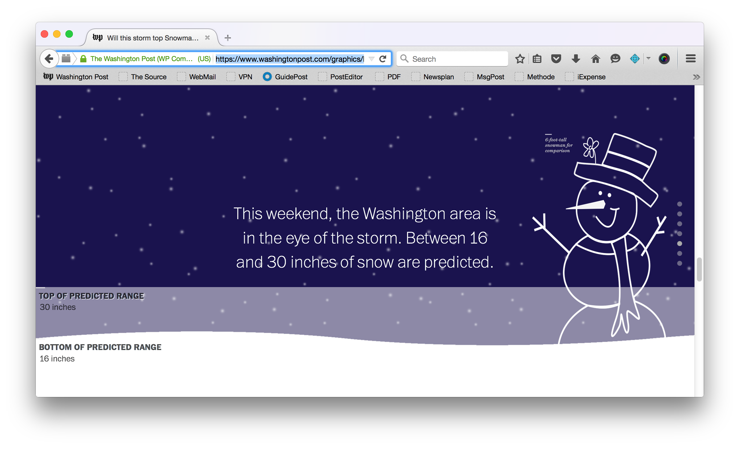
A few months earlier, I had had the crazy idea to use the browser window as a “water tank” to show how drought was affecting California’s reservoirs — Katie Park took that rough concept and ran with it, creating this great graphic that won a silver medal at SND Digital. With the snow coming, I started thinking about how I could compare the predicted snowfall for the upcoming storm with totals from history using the same concept — filling the browser window with the snow.
I figured out how Snowzilla compared, repurposed some of the code Katie wrote for the water piece, learned how to use CSS animations to make snow fall in the background, drew a silly snowman to give scale to the depth of the snow and put this simple piece out into the world.
If we do something like this again in the future, I’d love to make this run off live data. We could pull in the snowfall totals as they accumulate and animate the “snowflakes” and snow drifts in the graphic so they reflect the storm as it happens.
Role: Design, illustration, development, reporting

