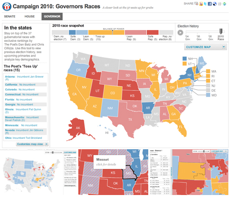
These three new race maps (house, senate, and governors) launched today with the new PostPolitics section of The Washington Post. I worked with Karen Yourish and Dan Keating, who are absolutely amazing data whizzes, to get the data together for the project, and Nathaniel Vaughn Kelso gave me some great base maps to start with. We really wanted to give a complete picture of the 2010 races, so we have current race ratings (for house, we have state of the race), election history for each district or state, and demographic information that lets you see some cool patterns — like how states vote when they have a high percentage of seniors or high poverty rates.
The house map has some really cool zoom functionality, which was a challenge to program because of the panels for the details and additional options (left and top right). I wanted the selected district to always be showing, so I made it so the zoom responds to movement of either panel. It zooms to district level depending on the size of the district, and if you use the dropdown to select a state, it zooms to state level depending on size of the state.
The maps have charting up top and a list on the left side, as well as a history slider, which lets you go back and look at how elections have gone in past years. That’s a cool way to see patterns as well — for the past few years things have been trending Democratic, so it’ll be interesting to see how the elections go this year.
I think these maps turned out well. They have a lot of information in them, but I tried to keep it organized and simple to use. If you want the more complex options, you can customize the map by using the advanced filters, but otherwise you have a pretty simple interface to deal with. Let me know what you think!
