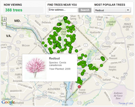
We published this graphic for Arbor Day, which was on April 30. It takes a look at all the trees that have been planted by the non-profit organization Casey Trees since 2003. They’ve planted thousands of trees in order to try to increase D.C.’s “urban canopy.” You can use this tool to see where they’ve planted trees in your neighborhood and what kind they are.
From a technical standpoint, this project was really interesting. It was executed in about two days, so it was a really quick turnaround, considering I haven’t done extensive development with the google maps api. Nathaniel and Gene worked up some cool custom tiles, and I designed and programmed a lot of it, and fit all the pieces together.
It was my first time working with clustering in google maps, which was pretty unwieldy. Initially it was taking a really long time to load — with a couple thousand points it was fine, but after that it would have a serious load lag. I played around with some different methods of clustering (circles with numbers in them were my favorite), but the mechanisms I was using due to time constraints weren’t as customizable as I wanted and ended up not solving the problems I ran into. For something bigger I’m interested in developing some more useful clustering techniques. I tried the MarkerClusterer class from the Google Maps API extras classes, and it accomplished some of what I wanted but it was clumsy when I wanted to add and remove points from the map and recluster accordingly. It was a fun and educational to play around with different methods of organizing the markers and figuring out how to optimize the loading experience.
I think the solution we came up with works — it’s on the scale of the project. Not super fancy, but it doesn’t really need to be. It’s a fun little piece that tells you where the trees are in your neighborhood, and where efforts to green the city have been focused.
