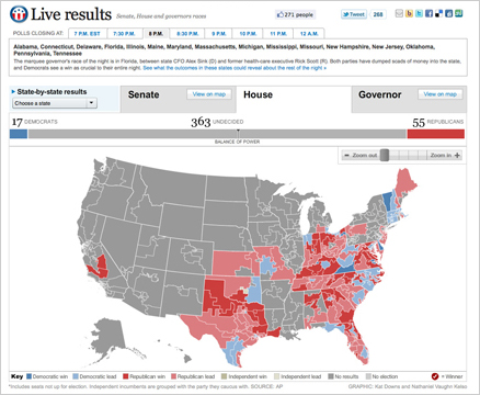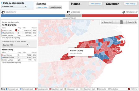
On Nov. 2, midterm election day, we put up these maps that tracked the results as they came in. For Senate and Governors we had state and county-level data, and we had House districts as well. This suite of maps was published in The Washington Post, as well as on Yahoo! News and the Telegraph (UK). The maps have balance of power charting and tabular results as well as zooming and deep linking features.

The most interesting part of the development of these maps was that because we wanted to have all the maps in one flash file (to reduce load time and to allow users to find results for a certain state for all three races w/o loading separate pages), we drew all the maps dynamically. Nathaniel Vaughn Kelso created boundary files for all the shapes we would need for state, district and county maps and I set up a class that draws map shapes and gives them basic features (area, stroke, fips). Seeing as how every time I try to open up actual vector shape files for a county map in the Flash IDE the program totally freaks out, I’m thrilled to have a new way building maps that feature a large number of shapes.
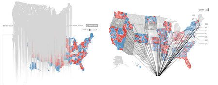
As I was programing the drawing and we were shifting some of the coordinates and the scale, we had some very funny drawing errors…I love it when you get something awesome looking from a drawing error 🙂

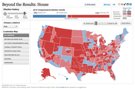
We also updated the preview maps so they allow users to do more analysis on the results. In the future, I’m hoping we can reorganize our data feeds so that we can consolidate our analysis + results in one place. But for now I think these analysis maps are a really interesting tool that looks into how the results and gains break down in terms of key demographics.
