Published in The Washington Post, December 3, 2009
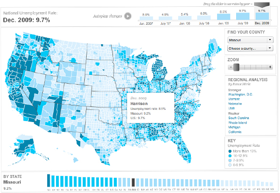
This map shows the change in unemployment rate over time on county, state and national levels. This was a quick-turnaround project — the initial version was done in two days, with about three days of upgrades. I imported simplified county shapes into Flash, and built all the functionality and the interface, which includes charting for U.S. and state unemployment rate. It also has historical unemployment data that lets users go back and see how their county has fared for the past two years. It features zooming and panning, as well as quick-select menus on the right side. We’ve also highlighted certain regions, so when you click on those you get a detailed analysis and a zoomed in view.
Role: Design, programming, research
Tools used: Flash/ActionScript 3.0, MaPublisher
Awards: SND Quarterly (Winter 2009)
